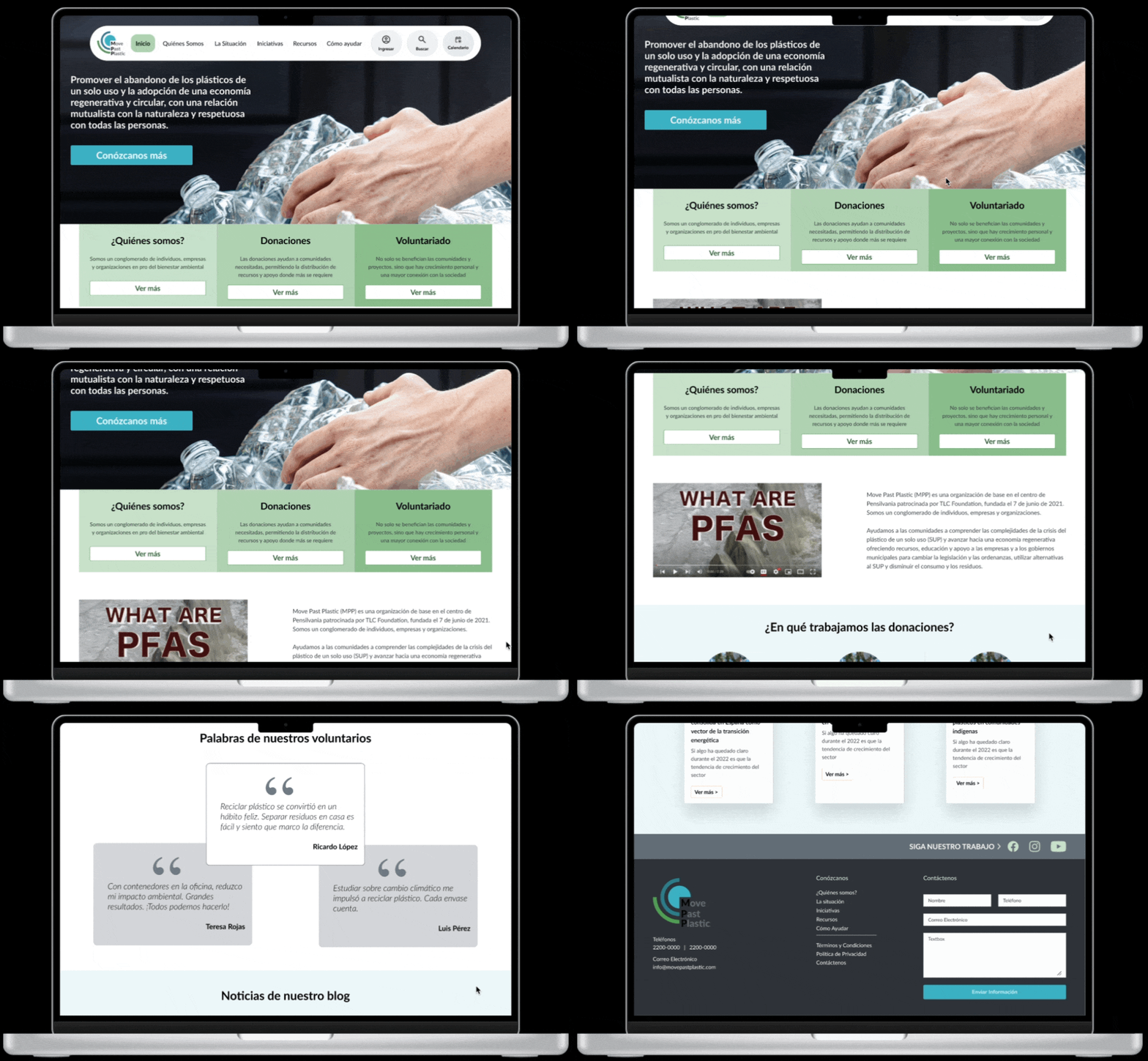
MPP System Redesign
Enhancing the user experience by improving navigation, optimizing for mobile, and modernizing the interface to better serve the users of the MPP System.
Time Frame
3 Months
Team
Only me
Role
Product Designer
Platform
Web Responsive
Business Model
Environmental or Non-Profit
The MPP System Redesign aimed to enhance user experience by improving navigation, optimizing for mobile, and modernizing the interface. The project focused on providing a more intuitive and responsive platform for the system's users.
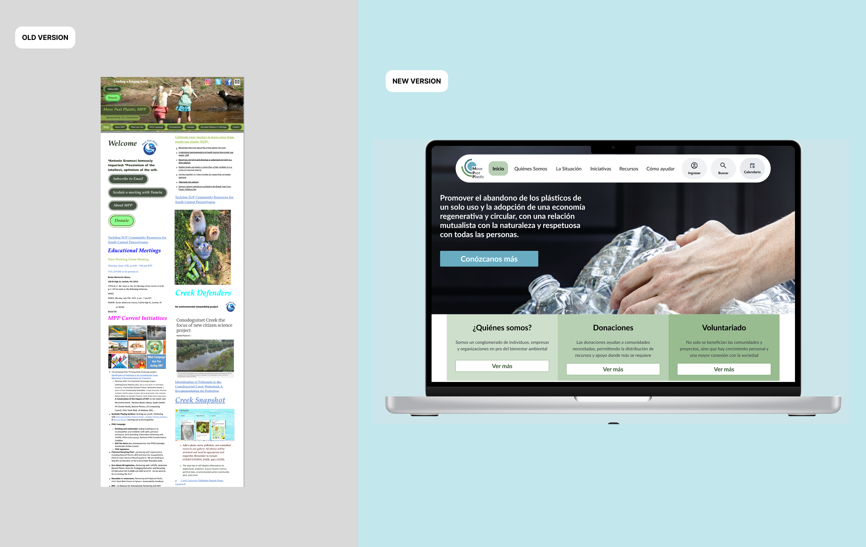
The original system had complex navigation, poor mobile optimization, and an outdated design, leading to user frustration and reduced engagement. The redesign addressed these issues by implementing a user-centered design approach and best UX practices.
Challenges
The original MPP system presented several key challenges:
- Complex Navigation: Users struggled to find relevant information due to a cluttered interface.
- Poor Mobile Experience: The platform was not optimized for mobile, hindering accessibility for users in the field.
- Outdated Design: The design did not align with modern user expectations in terms of aesthetics and usability.
Goals
- Simplify navigation to improve user experience and accessibility.
- Optimize the platform for mobile devices, ensuring usability on the go.
- Modernize the interface to align with current design standards and user expectations.
Design Process
Heuristic Analysis
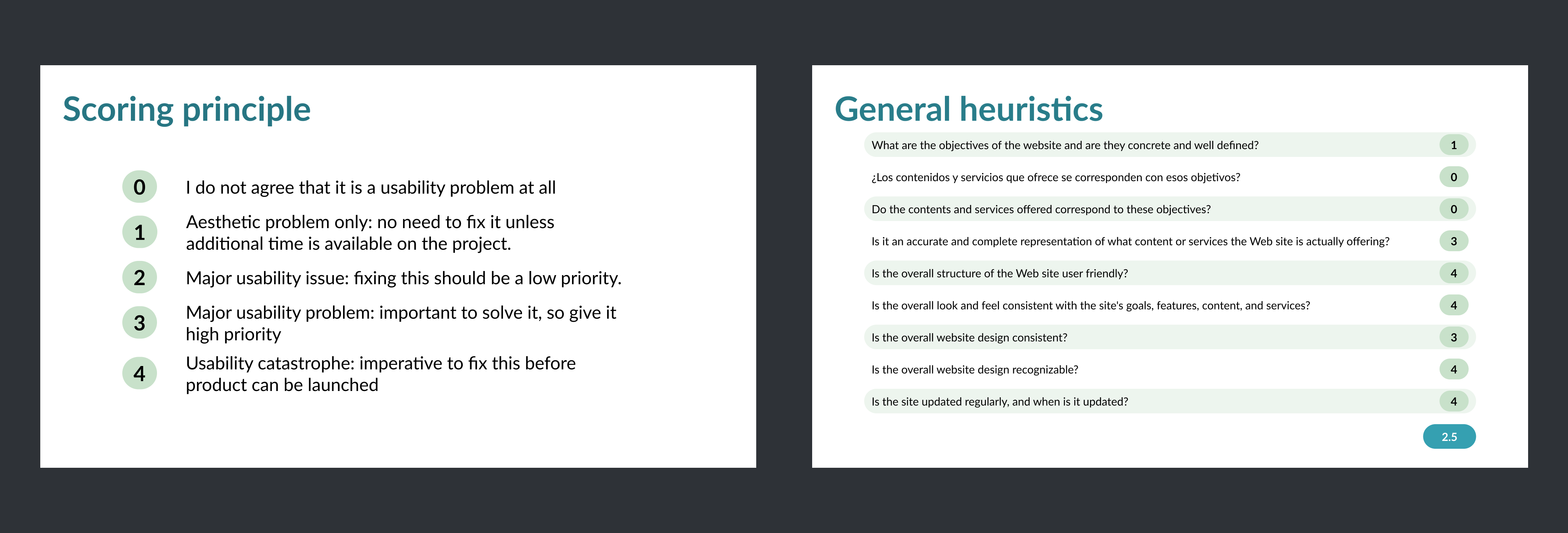
The redesign process began with a heuristic analysis to identify key usability issues. This analysis revealed problems with navigation, consistency, and error prevention that needed to be addressed. This analysis was applied to the current website (https://movepastplastic.com/index.htm)
- Navigation Issues: Users had difficulty finding what they needed.
- Inconsistency: The design was inconsistent, causing confusion.
- Error-Prone: The system led to frequent user errors.
Define
Information Architecture
After the heuristic analysis, the focus shifted to reorganizing the system's information architecture. The goal was to make content more accessible and easier to navigate.
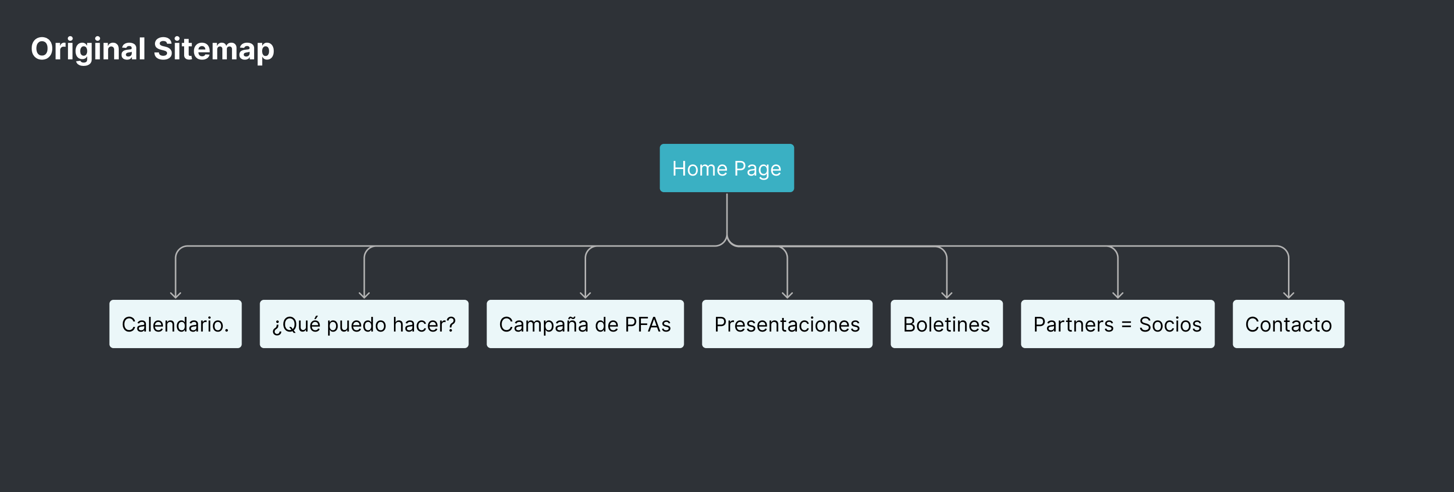
For the first activity, a card sorting exercise was done using Optimal Workshop. The results were analyzed using a dendrogram and Principal Component Analysis (PCA) to help create a new sitemap proposal.

With the insights from the card sorting exercise, a new sitemap proposal was created. This new structure is more organized and segmented based on the content's purpose. The reorganization provides a more intuitive navigation experience, aligning content with user needs and improving the overall usability of the site.
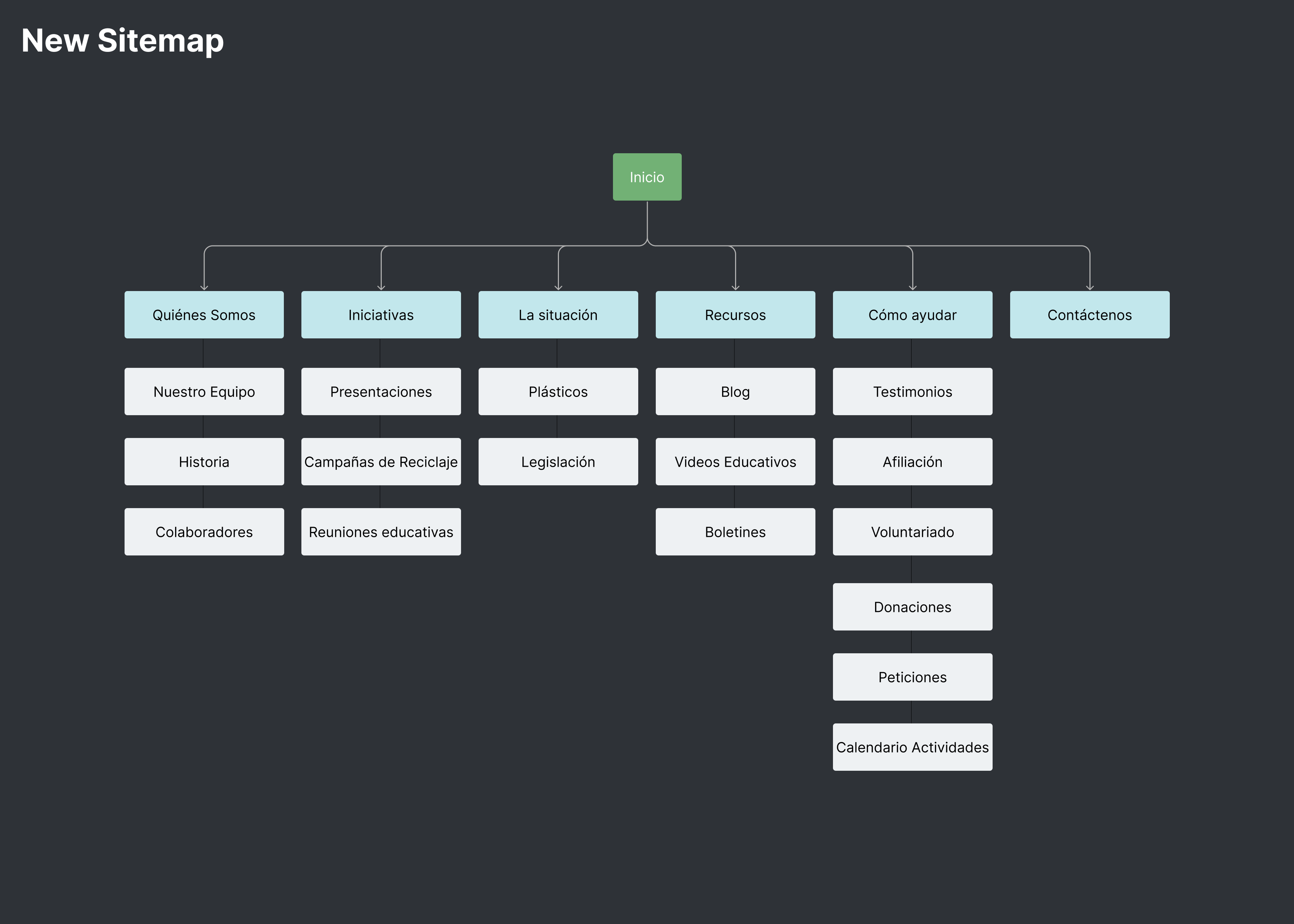
To see if the new sitemap was more effective, a tree-testing exercise was conducted. This test involved checking how well users could complete different navigation tasks and evaluating the effort needed. Additional user feedback was also gathered to further refine and optimize the sitemap.
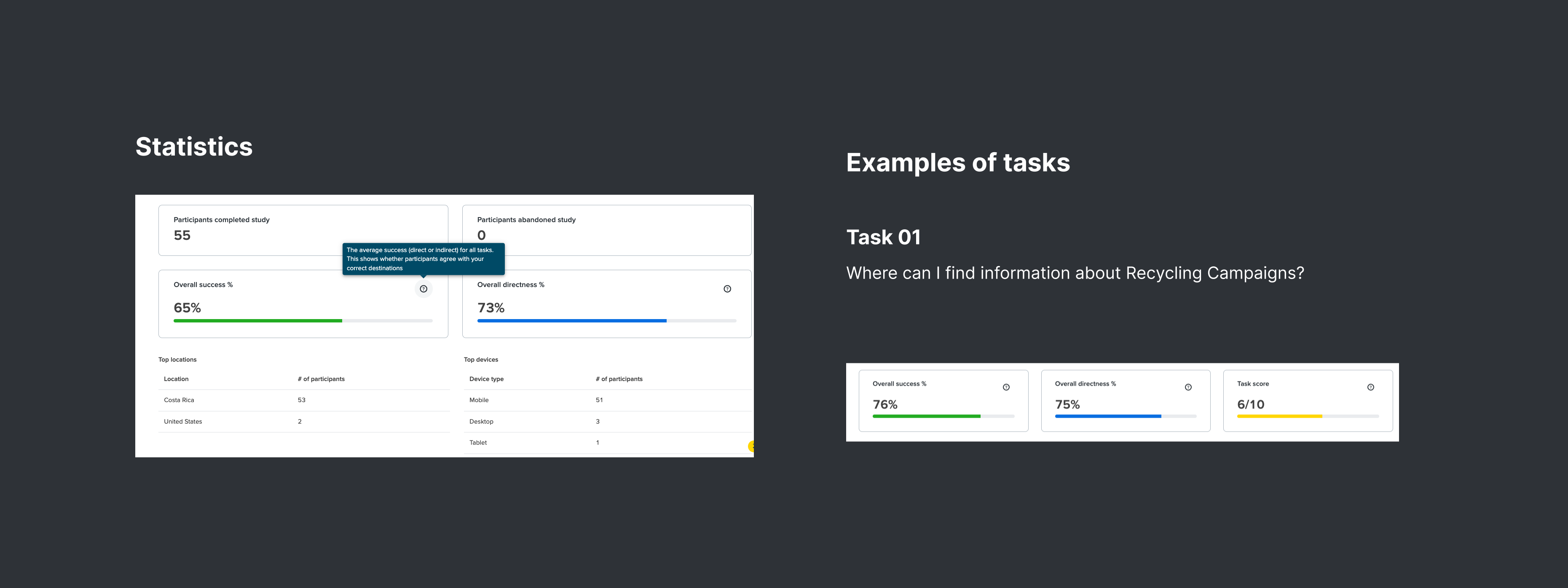
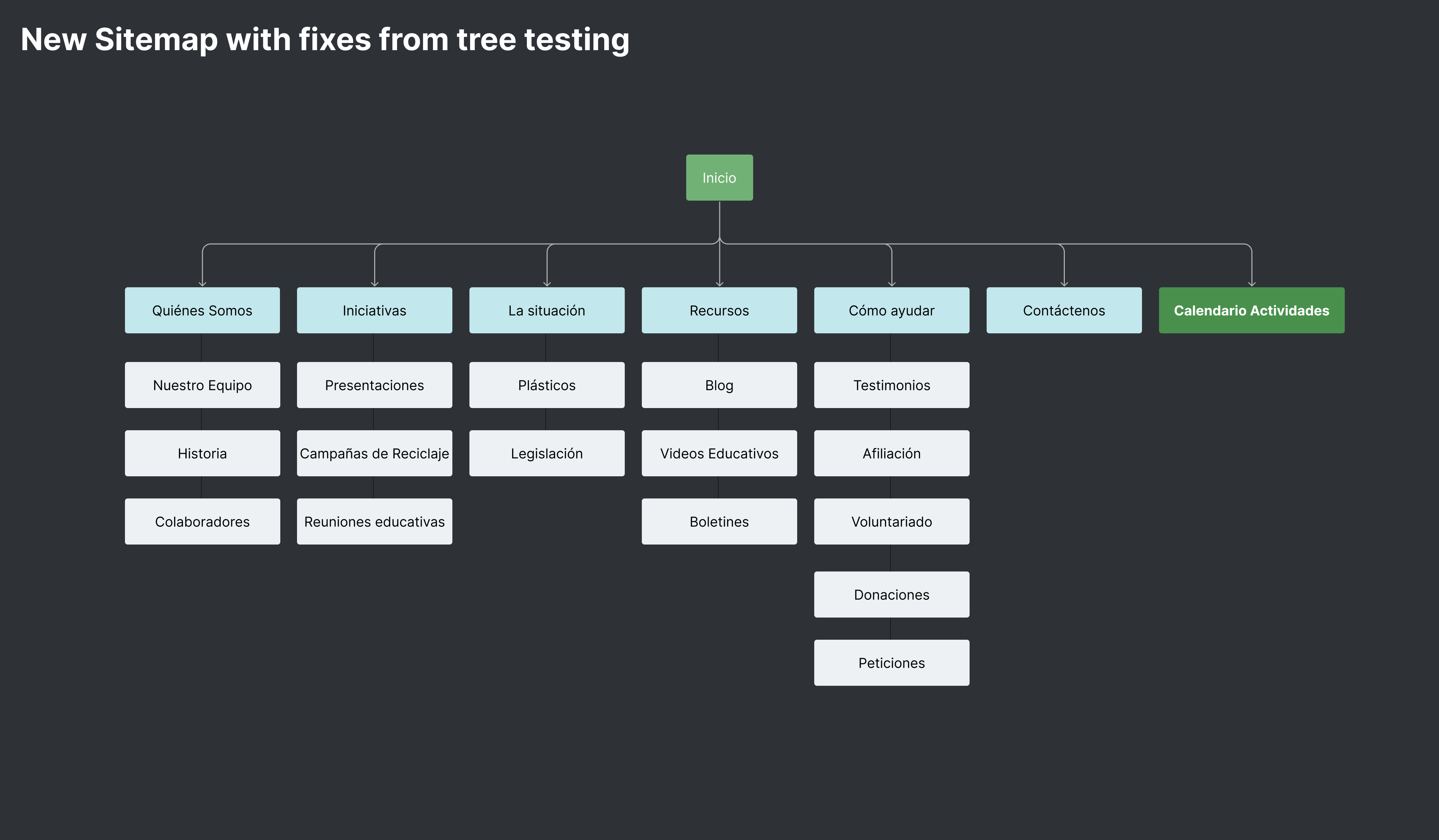
The tree tests provided valuable results that led to final adjustments to the site map. Additionally, important feedback was received, which played a key role in developing the prototypes. This feedback helped refine the navigation structure, ensuring that the prototypes would meet the users' needs and expectations.
Low-Fidelity Prototyping
Low-fidelity prototypes were created to visualize the new information architecture and demonstrate the basic functionality of the redesigned system. These wireframes were used in user testing sessions to gather feedback.

UI Design
A detailed style guide was created with a strong focus on accessibility, ensuring it meets AAA standards of the Web Content Accessibility Guidelines (WCAG). A custom design system was developed, including essential components like navigation, forms, and layout structures, all adhering to Atomic design principles. This system enhances visual coherence, supports scalable design, and streamlines the creation of high-fidelity prototypes, allowing for quick iterations and consistent updates.
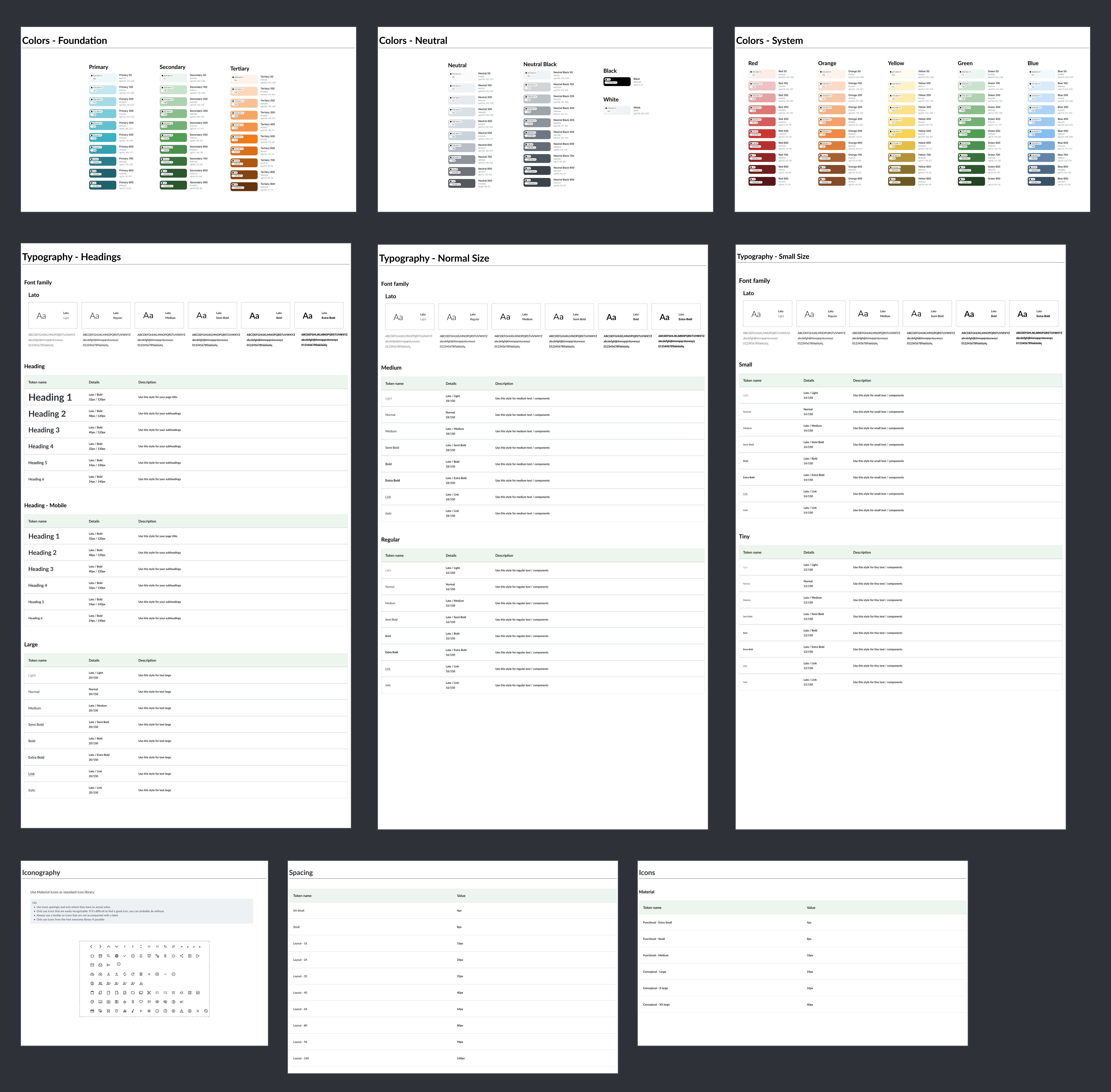
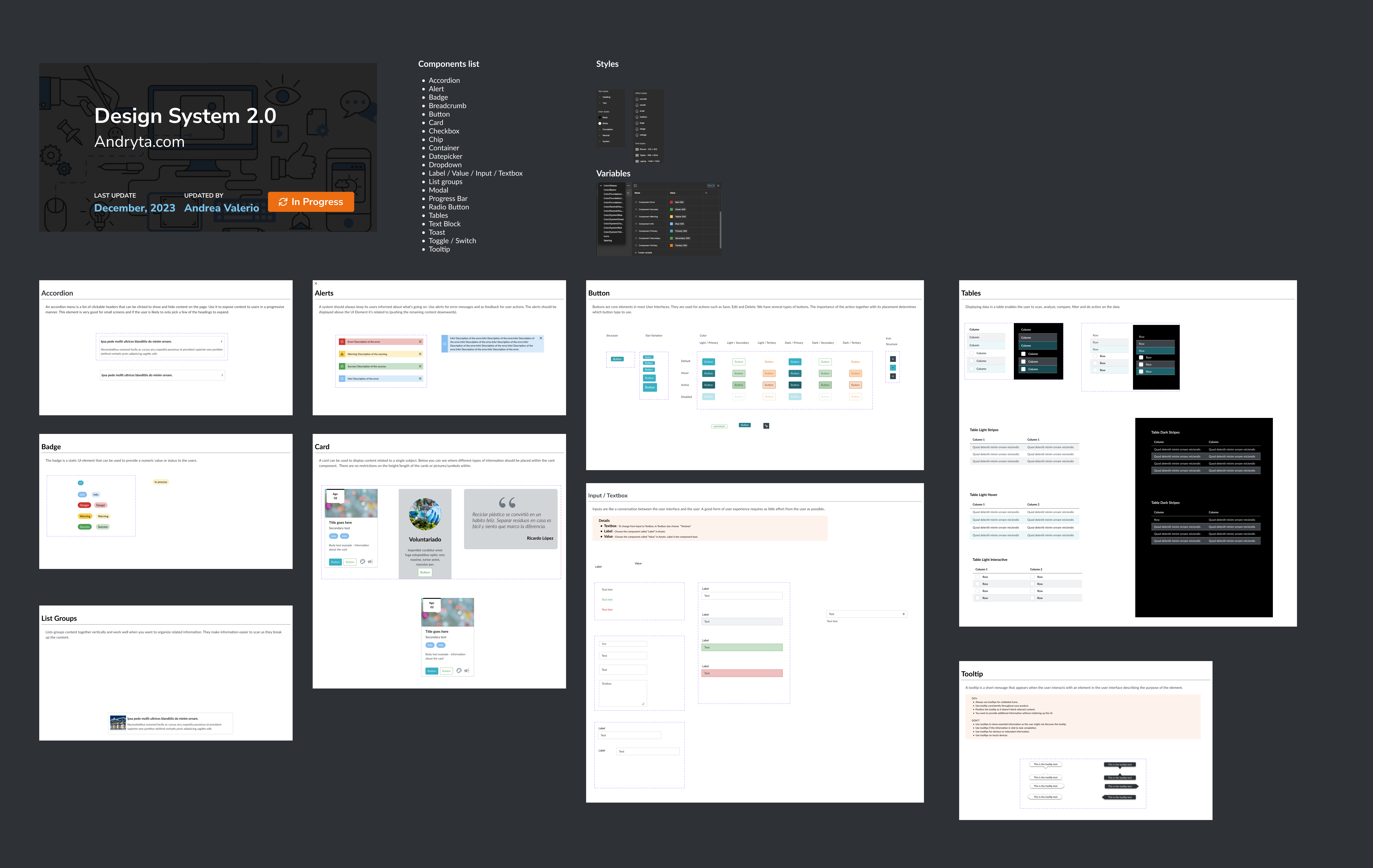
Stylescape
The UX stylescape process emphasizes the importance of accessibility, user feedback, and iterative design. By focusing on these elements, the goal is to develop a cohesive, inclusive, and user-friendly design that aligns with the website's overall concept while meeting the highest accessibility standards.

Site Components
After defining the styles and design system, site components were created for the high-fidelity prototypes using Atomic design principles, which break down the design into reusable building blocks. This approach ensures consistency and flexibility across the project, making it easy to update and maintain the design. The structured method allows for quick iterations, adapting easily to new requirements, ensuring a user-friendly final product.
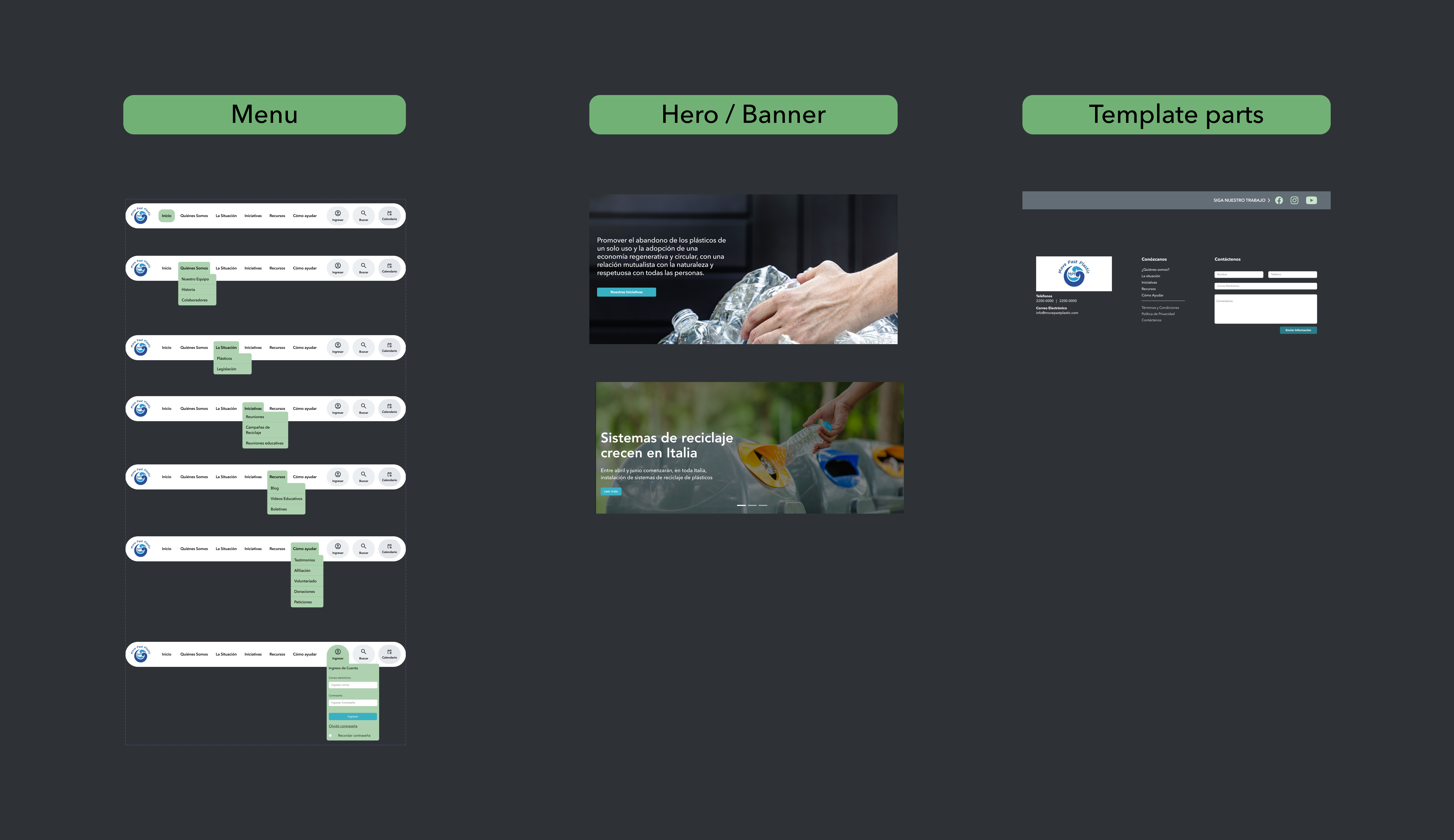
High-Fidelity Prototyping
The final prototypes were created for the desktop breakpoint, as required by the client, with every screen carefully developed for a cohesive user experience. User testing provided valuable feedback, leading to refinements in the design. This iterative process ensured the final product met the client's needs while delivering an optimal user experience.
Hi-Fidelity Wireframes - Desktop Version —
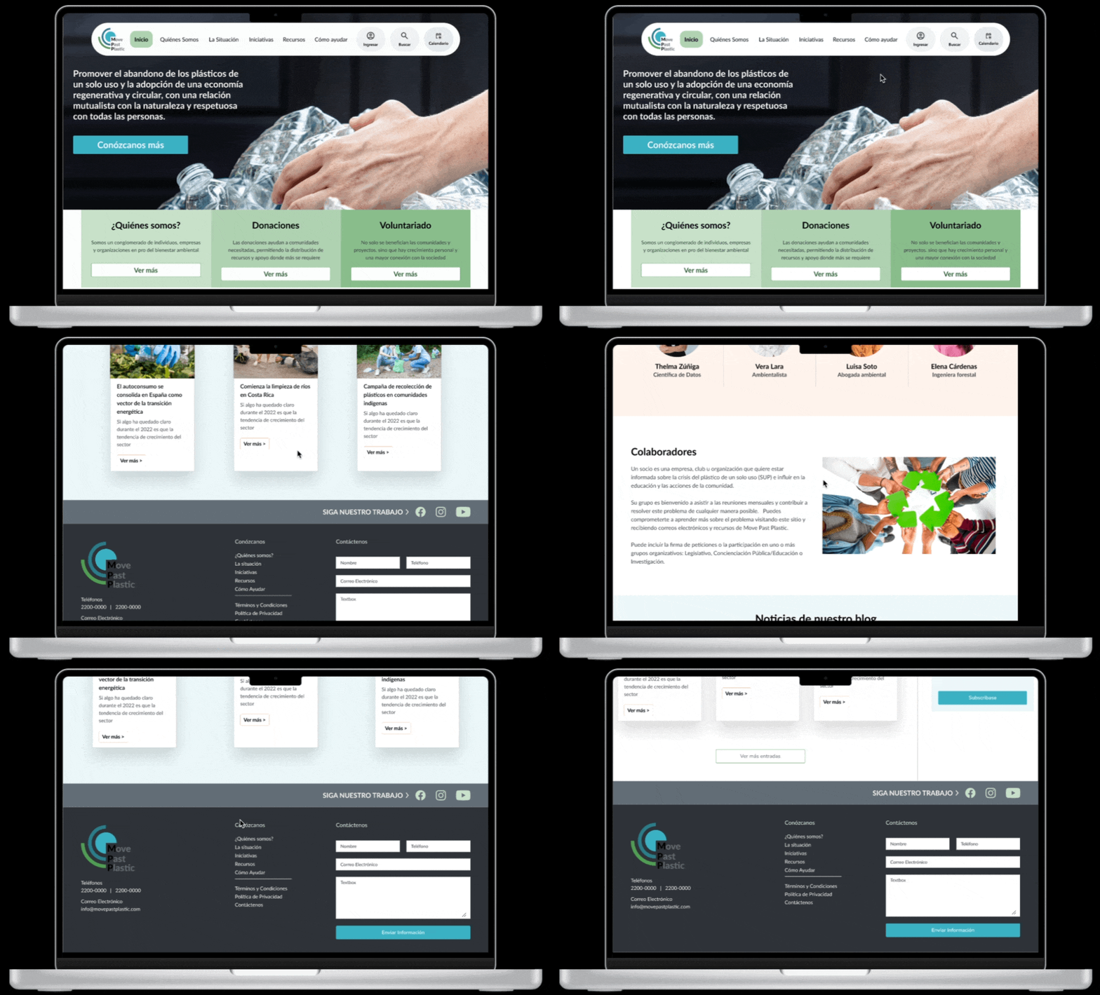
Solution
The final MPP system was a significant improvement over the original, offering a streamlined, user-friendly interface that is both visually appealing and highly functional.
Results
For the business, this resulted in enhanced visibility and reputation as a leader in sustainability efforts. The creation of community relations and attract eco-conscious consumers and partners.
- The platform provided valuable information and practical tips on reducing plastic use and recycling.
- It also offered interactive features that motivated users to participate in recycling programs and adopt more sustainable habits, ultimately contributing to a cleaner and healthier environment.
- Increased User Satisfaction: Feedback from users indicated a significant improvement in their overall experience.
- Higher Engagement Rates: The new system saw an increase in user engagement, especially on mobile devices.
- Reduced Error Rates: The streamlined processes and clear interface led to fewer user errors.
Reflections
This project emphasized the importance of user-centered design and iterative testing. By aligning with user needs, the redesign not only enhanced usability but also met the goals of the organization.