Agents Management
Responsive Application redesign for Agents Management
CRCOMM is one of the higest software company in sports betting - pay per head.
They would like to redesign one of the most used applications of the company, Agents Management.
This application has a traffic of around 30000 users.
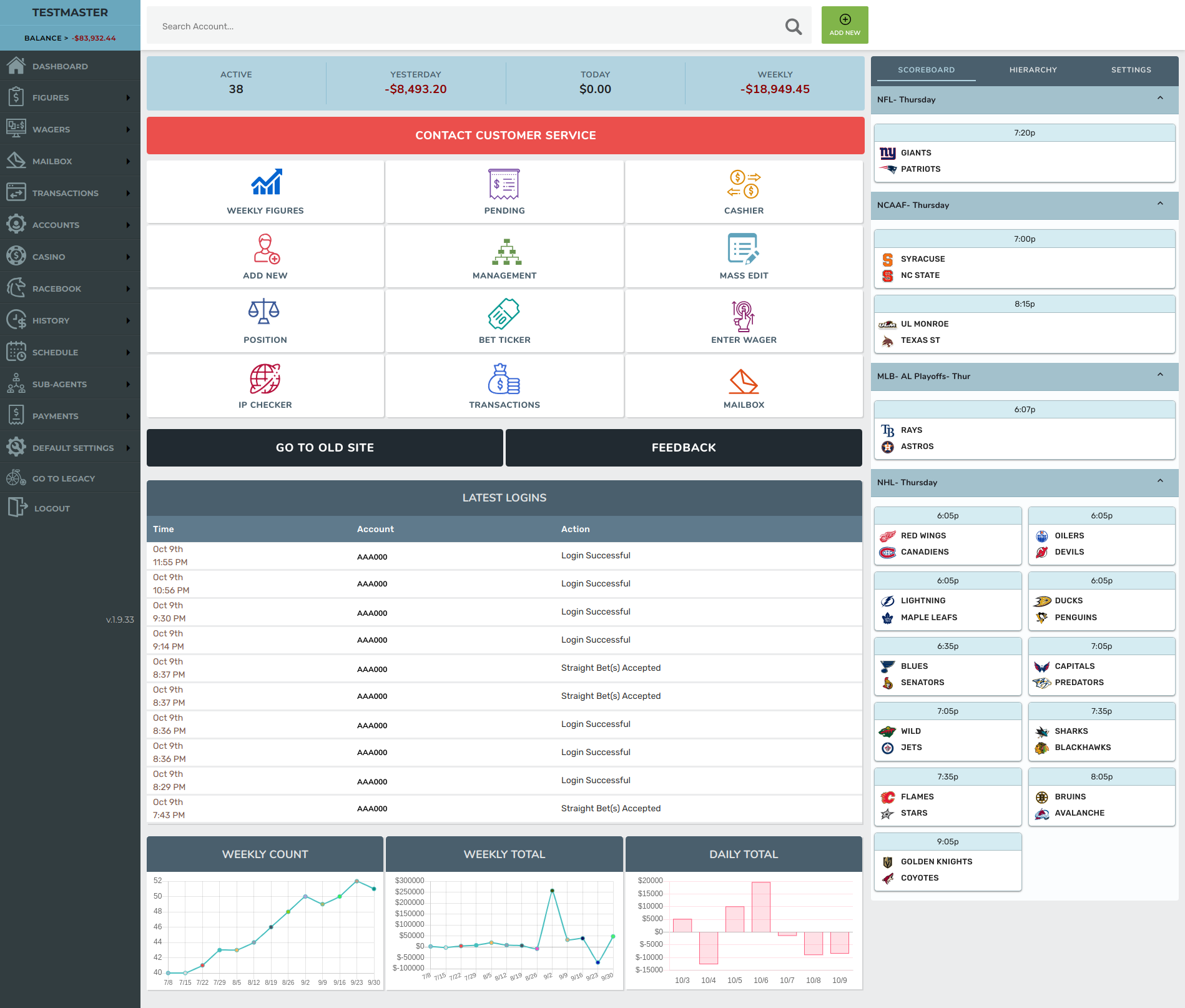
The Tasks
The application is out of date, from style / performance and technology platform (Angular 1.0).
The main business requirements:- Change the UI / design in the same old framework, Angular 1.0
- The MPV should be a responsive application
- It must be designed with new UI Standards
Goals
- Creation of a new / fresh dashboard, which contains more options than the current one
- Creation of a fresh admin responsive app, based on UI Standards
- Try to make the brand (fonts, colors, and even logo) feel more high-end and relevant
- Creation of a style guide documentation, where the dev can get info about colors, typography, components, etc
- Overall, the app should be attractive and functional
The Process
Understand
- Benchmark Analysis
- Stakeholders interviews / meetings
- Content Inventory of the current app
- AI - Creation of the Sitemap
Design
- Low-Fi Wireframes
- Style Guide - Creation and Documentation
- Components - Creation and Documentation
- Hi-Fi Wireframes
- A/B Testing
Build
- UI Styles / Components / Templates implementation in Angular framework
Understand
Benchmark Analysis
I needed to know what's the standards for Admin (templates, dashboard, branding guide).
Stakeholders' Interviews / Meetings
I didn't have access to the final users, so, through interviews and meetings with the Stakeholders I could check and create a "Protopersona"
Content Inventory
As a third method of the planned UX research, I did a study about the current Agents Management
App.
I need to know how it is connected, hierarchy, Actions, etc.
My findings:
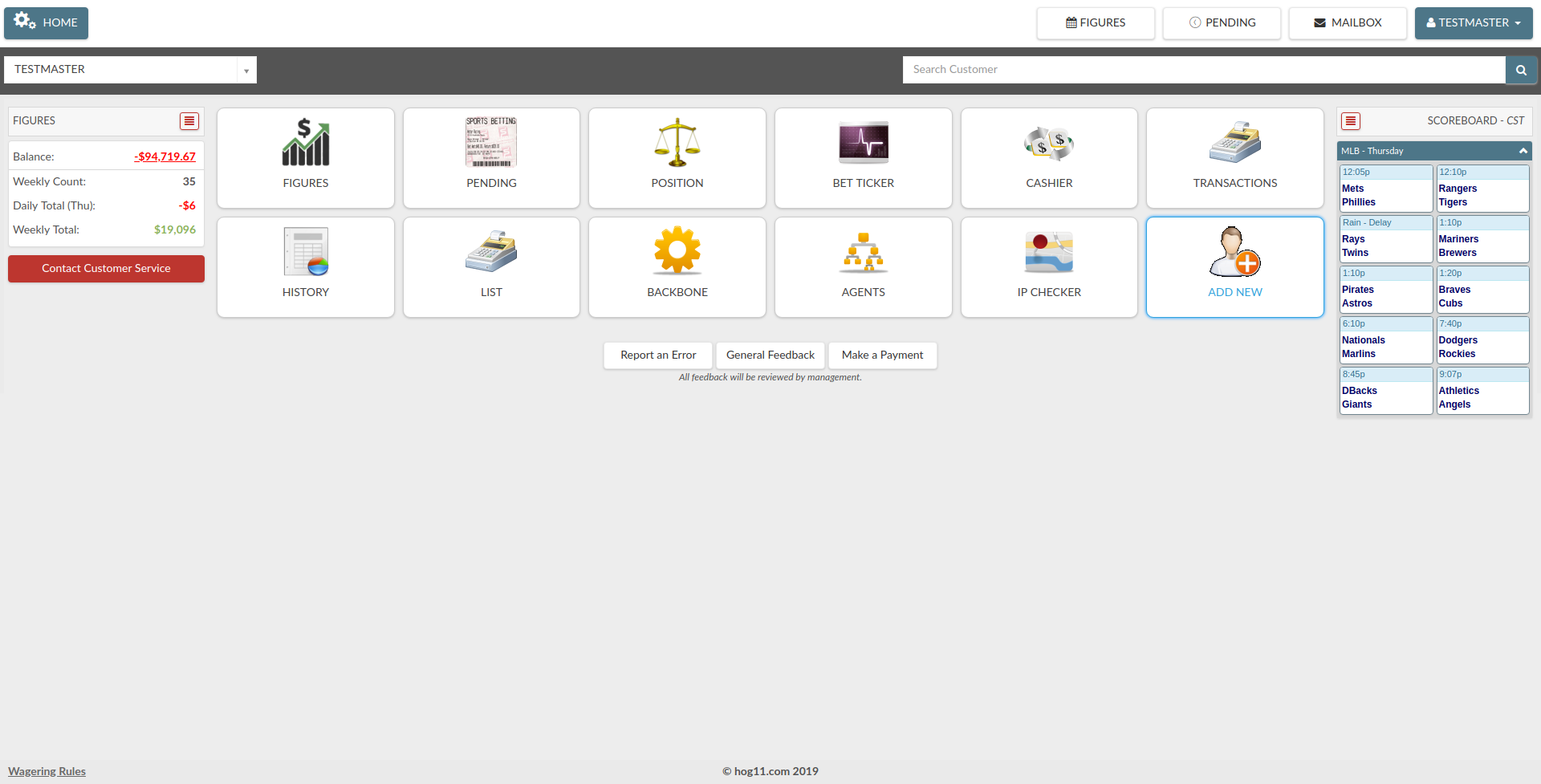
- The current App was a version 1.0 of the application
- This app didn't have a correct navegation (Main Menu, Top Menu)
- The design in this app was out of date
AI - Sitemap
With the Content Inventory and Brainstorming sessions with the stakeholders, I created a Sitemap. This had new features and the organization of the current information
Design
Low-Fi Wireframes
It's a guide to check how many templates, components and (main) pages is required to create the visual prototype
Style Guide - Creation and Documentation
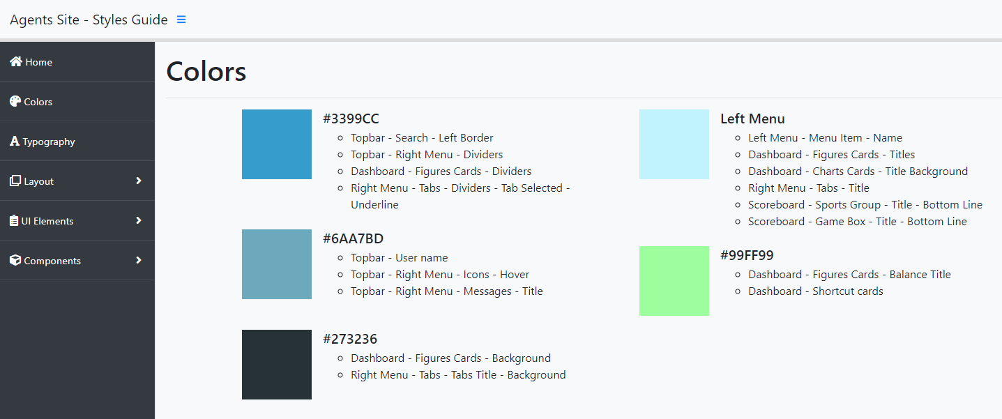
With this step, is possible to handle standard guidelines in the new website. The following elements were defined in this part:
- Color palette - 3 main colors and auxiliary color set
- Typography
- Iconography
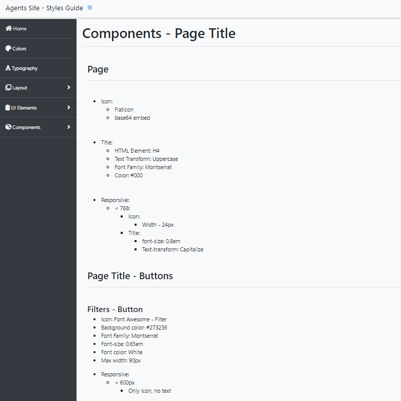
Components - Creation and Documentation
The molecules or basic components are necessary to keep consistency in the website and apply quick fixes on these components without changing one by one in the website design. Each component is documented for dev purposes.
For the proposal, I did the following basic components
- Buttons
- Input
- Textarea
- Datalist
- Select
Hi-Fi Wireframes
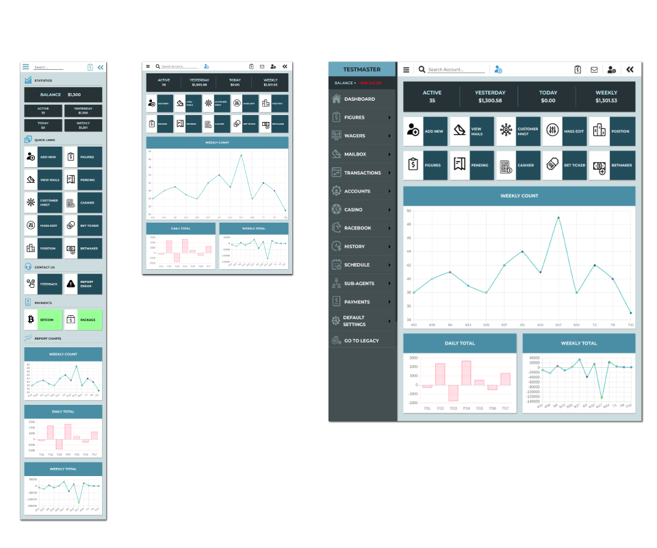
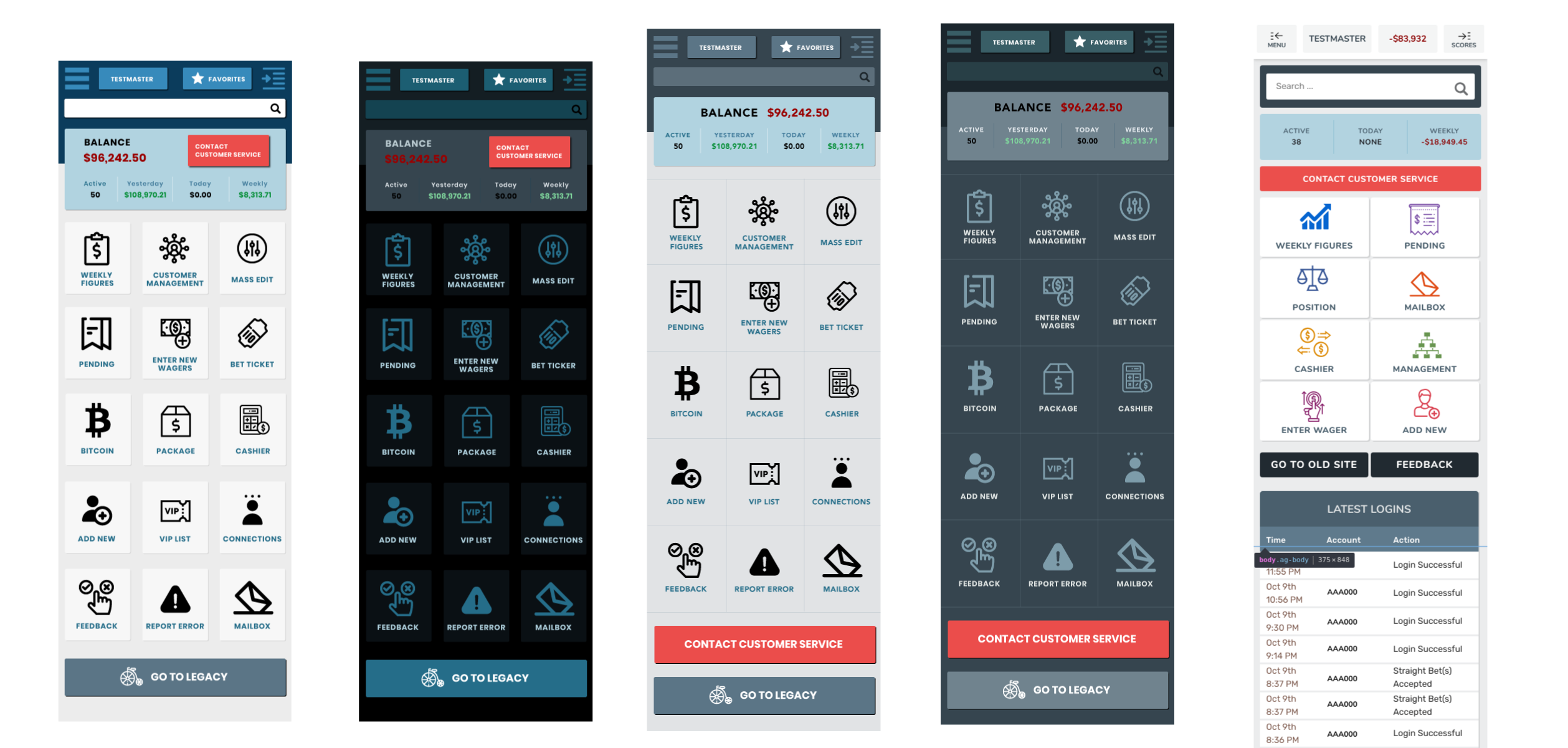
After the components study and documentation I did Hi-Fi Wireframes. I did some differents Wireframes for A/B testing and feedback as well
A/B Testing
I worked with stakeholders and some users in A/B Testing, based on the Hi-Fi Wireframes (check above). Check the final result below.
Build
UI Styles / Components / Templates implementation in Angular framework
I worked in the implementation of the new concept in the current project. In this part I work in the following parts
- Selection of the CSS Framework - We choose bootstrap. This framework helps with components and tokens (text, colors, spacing).
- Creation of templates and pages - Based on the IA Sitemap created before with the Content Inventory and Brainstorming sessions with Stakeholders.
- Creation of components - From Dashboard to tables. The creation of the components (HTML - CSS - JS) and their implementation in templates and pages
Final Product
This is the Final Product, implemented and tested:
Mobile - There are screenshots, move with right arrow keyword or the navigation (located
below at the page)
https://www.figma.com/proto/mqSJJgJFOCYxEMiAexAhFv/Agent-Site?node-id=14%3A129&scaling=scale-down&page-id=14%3A127
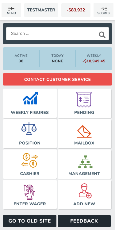
Tablet - There are screenshots, move with right arrow keyword or the navigation (located
below at the page)
https://www.figma.com/proto/mqSJJgJFOCYxEMiAexAhFv/Agent-Site?node-id=14%3A107&scaling=contain&page-id=5%3A403
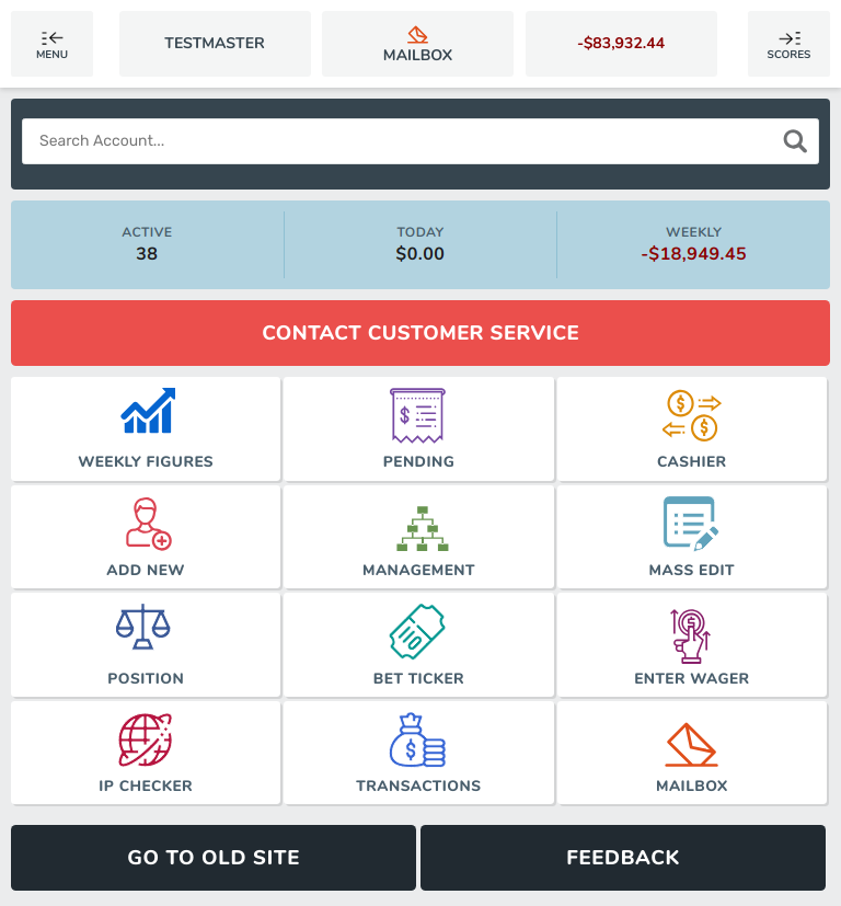
Large Device - There are screenshots, move with right arrow keyword or the navigation
(located below at the page)
https://www.figma.com/proto/mqSJJgJFOCYxEMiAexAhFv/Agent-Site?node-id=1%3A3&scaling=contain&page-id=0%3A1

Outcomes and Results
Goals Achieved
- The creation of a extended documentation from analysis until the creation of the prototype, combined with Guide Style and Components
Lessons learned
- The challenge to understand and analyze Apps with current UI Standards