Marsh Digital Infrastructure
Claude - Figma Make - Foleon Page Design
A full page designed from scratch using a sparse PDF and a few images as the only source material. Claude researched the domain, generated the content and narrative structure, and produced the Figma Make prompt — which then drove the visual design, translated component by component into Foleon.

Context & Challenge
A Full Page to Design. Almost No Content to Start From.
Marsh's Digital Infrastructure practice needed a Foleon page — a professional, narrative-driven publication for data centre owners, operators, investors, and developers. The ask was clear. What was available was not: a sparse PDF covering the practice at a high level, and a handful of reference images. No existing copy. No defined sections. No page structure. No content hierarchy.
The design had to be built from scratch, within Foleon's native component library — no custom JavaScript, no accordions, no tab interactions. Every content and layout decision had to be earned through research, not inherited from existing material.
The brief consisted of a sparse PDF and reference images. There was no existing copy, no section structure, and no narrative to work from — the content had to be researched and generated from scratch.
Digital infrastructure risk advisory is a specialist field. Without domain knowledge of data centre lifecycle risk, capital strategy, and AI modernisation, the content couldn't be shaped into anything credible.
A Foleon page requires a defined section sequence, a storytelling arc, and a clear CTA path. None of these existed. The page architecture — from awareness to lead generation — had to be designed before any visual work could begin.
Every design decision had to work within what Foleon actually supports — no tabs, no accordions, no custom interactions. The page had to feel rich and navigable using only native block components.
adjustThe Brief
Design a full Foleon page for Marsh's Digital Infrastructure practice — from content to layout to production — using a sparse PDF and reference images as the only starting point. Claude would handle the research and content generation. That research would then directly produce the Figma Make prompt. The resulting design would be translated into Foleon-native components.
Starting Point
What Was Actually Available
The total source material for this project: a sparse PDF describing Marsh's Digital Infrastructure practice at a high level, and three reference images — a visual showing the data centre lifecycle phases, a stats slide, and a content architecture diagram. No copy. No defined tone of voice. No section structure. Not enough to design from directly.
The Only Structural Reference
The content architecture diagram was the most useful artefact — it sketched a page journey from relevance through urgency, authority, problem areas, examples, and lead generation. But it was a diagram, not a brief. It showed a logical sequence of boxes, not a narrative. Turning it into a page that felt like a conversation required the gaps to be filled first.
That's where Claude came in. Rather than designing around what was missing, I used Claude to research the domain, understand the audience, generate the content, and build the page architecture — before any visual decisions were made.
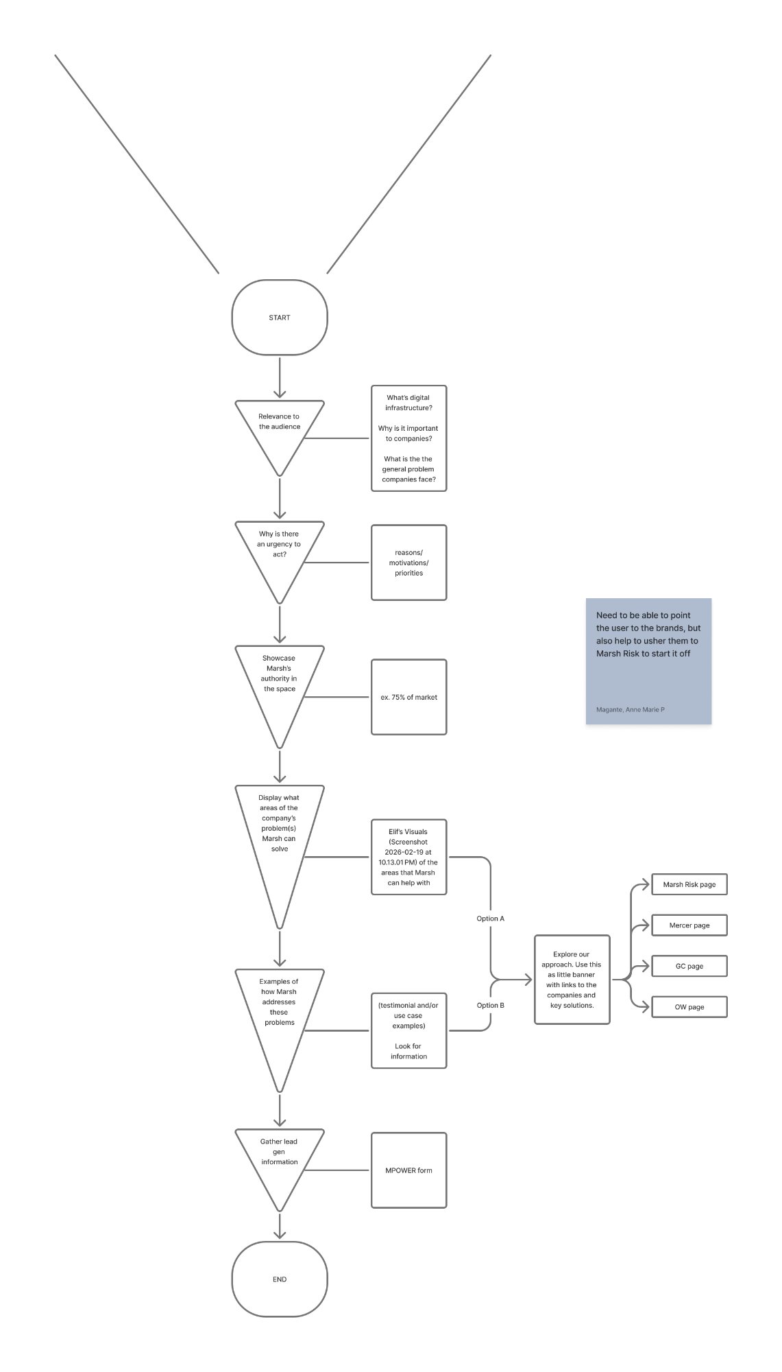
The content architecture diagram — the closest thing to a brief. A logical flow with no copy, no tone, and no section detail. Claude was used to turn this skeleton into a full content structure.
Reference Images from the PDF
Two visuals from the sparse PDF provided directional context — not content ready to use, but signal about what the practice covers and how Marsh presents authority.
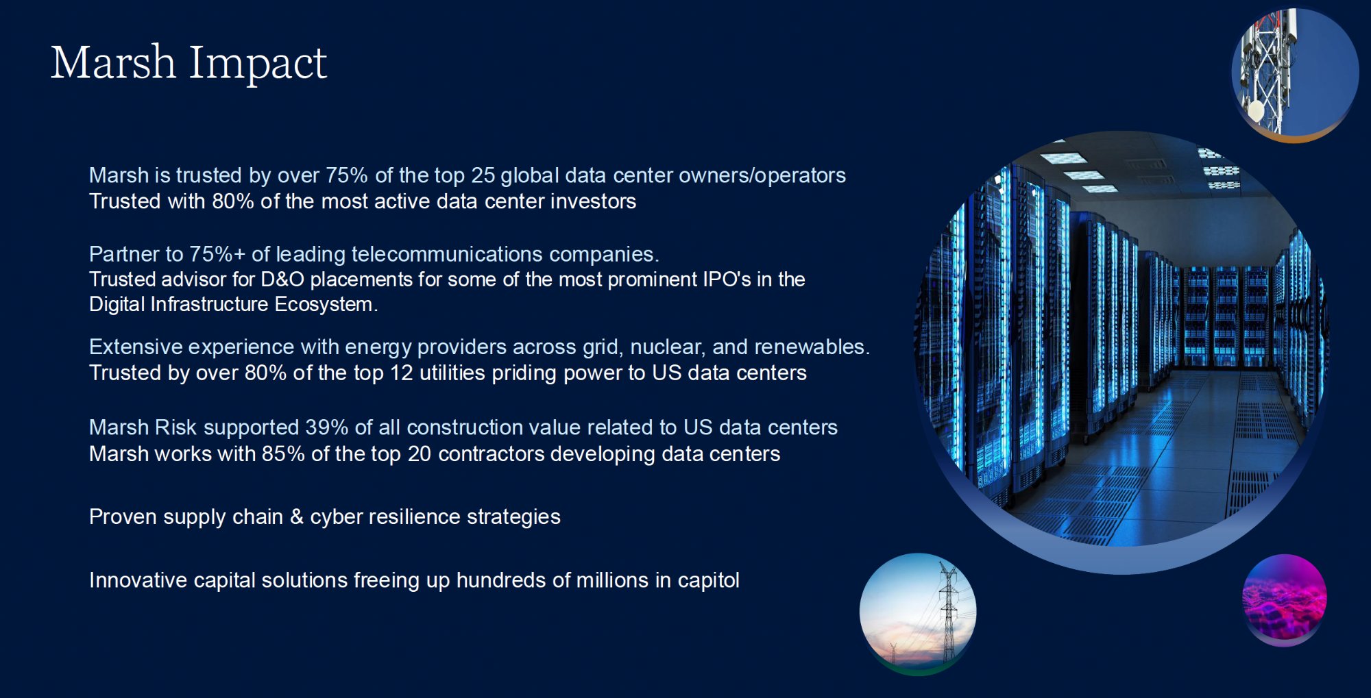
A stats slide from the PDF — the only signal of Marsh's authority data. Not copy-ready, but used as research input to Claude to generate the authority section content.
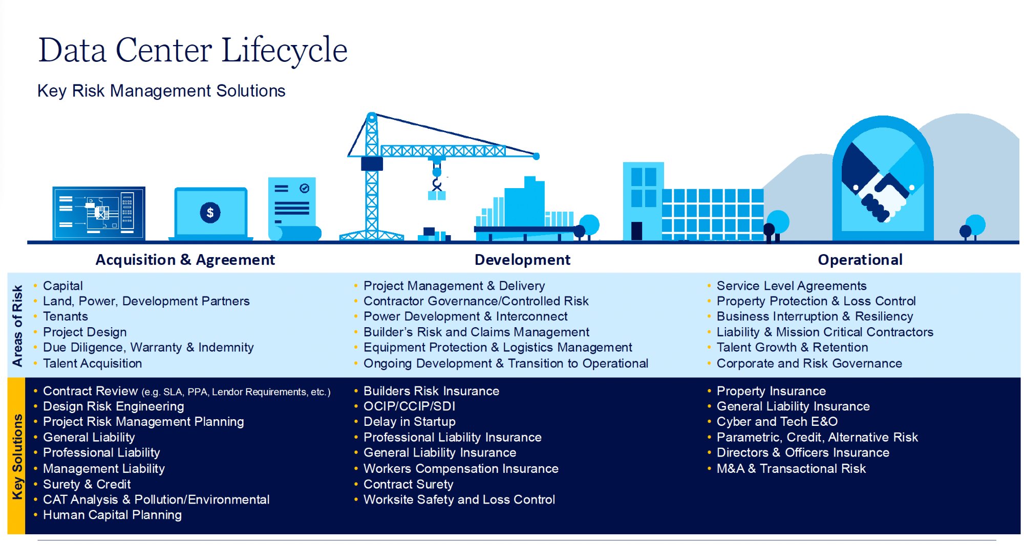
The lifecycle diagram from the PDF — three phases (Acquisition, Development, Operational) with risk areas per phase. The structure was informative; the content was sparse. Claude used this as a research anchor to generate full section copy.
The AI Workflow
Claude → Figma Make → Foleon
With sparse source material and no existing content to build from, the workflow had to start somewhere unusual: research. Claude was used first as a domain researcher and content generator — building the knowledge base, writing the page from scratch, and producing the structured Figma Make prompt that made the visual design possible. Figma Make generated the design from that prompt. Foleon translated it into a live page.
smart_toyStep 01 — Claude
Domain research, content generation from scratch, and structured Figma Make prompt output — Claude filled the gap left by the sparse brief.
- Domain research: data centre lifecycle risk, capital strategy, AI modernisation
- Audience analysis: operators, investors, developers
- Full page content written from scratch (6 sections)
- Narrative architecture: relevance → urgency → authority → phases → solutions → CTA
- Marsh brand token extraction from Brand Center
- Structured Figma Make prompt generated from research output
- Foleon component constraint mapping
auto_awesomeStep 02 — Figma Make
Visual design generated from Claude's structured prompt — brand-compliant components, ready for management review and Foleon translation.
- Hero, context, stats, lifecycle, and solution sections
- Marsh Serif / Noto Sans typography scale
- Exact colour token application per component
- Spacing and shadow specifications
- Mobile adaptation specs (390px breakpoint)
webStep 03 — Foleon
Component-by-component production translation — every design decision mapped to what Foleon can natively build, no custom code.
- 3-column block rows for phase cards
- Text + background colour blocks for stat sections
- Tag elements for service chips
- Two-column blocks for solution layouts
- MPower form integration for lead gen
tuneFoleon Component Constraints
A key part of the workflow was mapping every proposed interaction against Foleon's actual native component library — before a single design decision was committed. Components that didn't exist were replaced with Foleon-native equivalents that achieved the same UX goal.
- Accordion component
- Tab component
- Custom JavaScript interactions
- 3-column block rows
- Tag / chip elements
- Background colour blocks
- Two-column layouts
- MPower form embed
Key Decisions
Design Choices That Shaped the Output
Each decision in this project was shaped by one of three constraints: the sparse starting material, Foleon's component library, or Marsh's brand guidelines. None of the content decisions could reference existing copy — they all started from Claude's research.
| Decision | What I Chose | Why | Tradeoff |
|---|---|---|---|
| Using Claude as researcher, not editor | Claude researched the domain from scratch and generated all page content before any visual work began | There was no existing copy to edit or rewrite. The only way to produce credible, audience-appropriate content was to use Claude to understand the domain — lifecycle risk, capital strategy, AI modernisation — and generate it from the ground up. | Claude's research had to be reviewed carefully for accuracy against the sparse source material. Domain-specific claims were cross-checked before committing to copy. |
| Research output as Figma Make prompt | Claude's structured content document became the direct input for the Figma Make prompt — no separate briefing step | Once the content structure and brand tokens were defined, the prompt could be derived directly from the research. This eliminated a translation layer and ensured the visual design reflected the content decisions exactly. | Tightly coupled content and visual decisions — changing the narrative structure meant regenerating the prompt and design sections. |
| Narrative rhythm rule | Context paragraph → stat block → payoff paragraph. Stats never open a section. | When generating content from research, there's a tendency to lead with data. Claude was instructed to always establish context first — so the reader understood why a number mattered before seeing it. | Longer copy per section — but significantly higher comprehension and a page that reads as a conversation, not a statistics deck. |
| Phase layout component | Three-column static card row (Foleon native) instead of tabs or accordion | Tabs and accordions don't exist in Foleon. The card row lets all three phases be visible simultaneously — users scan, then read. Mapped in Claude's constraint audit before any design started. | All three phases show at once — less depth per phase, but better orientation for the reader. |
| HTML as simulation layer | Full-fidelity HTML proposals using Marsh brand tokens, not Figma mockups | Foleon doesn't have a preview environment for proposals. HTML in a browser was the closest simulation of the real Foleon experience — and Claude could generate these directly from the design decisions. | Proposals are not the final build — but they served as build-ready specifications for the Foleon designer, reviewed and approved before production. |
Design Evolution
From Sparse PDF to Live Foleon Page
The design moved through a deliberate sequence: Claude researching the domain and generating all content from the sparse source material, that research becoming the Figma Make prompt, Figma Make producing the visual design, and the approved output being translated into Foleon production. Two proposal versions were produced — each allowing specific decisions to be reviewed independently.
Step 1 — Claude Researches the Domain and Generates the Content
With the sparse PDF and BAU diagram as anchors, I used Claude to research Marsh's Digital Infrastructure practice — the data centre lifecycle, the risk profile of each phase, the capital strategy services, and how Marsh's four brands (Risk, Guy Carpenter, Mercer, Oliver Wyman) relate to this audience. Claude produced all six sections of page content from scratch: headlines, body copy, stat context, phase descriptions, and CTA language. The instruction throughout was to write in everyday spoken language — not for a slide deck, for a reader.
| What the PDF Had | What Claude Generated |
|---|---|
| Phase names: Acquisition, Development, Operational | Full phase narratives with risk context, key exposures, and Marsh service mapping per phase |
| Bullet list of Marsh services | Four structured solution blocks with headlines, body copy, and case study framing |
| Stat figures (market size, Marsh presence) | Contextualised stat sections: setup paragraph → stat → consequence paragraph |
| No CTA or lead gen copy | Full lead generation section with trust signals, audience-specific framing, and form rationale |
Step 2 — Claude's Research Becomes the Figma Make Prompt
Once the content was generated and the page architecture confirmed, Claude produced the Figma Make prompt directly from its own research output — encoding the section structure, copy hierarchy, Marsh brand tokens, typography scale, and layout specifications into a structured design prompt. This wasn't a separate briefing step; the research and the prompt were the same document, one producing the other.
Figma Make generated the visual design from that prompt — iterating in the prompt interface to refine layout, spacing, and component anatomy. Three sections were prototyped first: the hero (split-column with stat card), the context section (editorial text approach), and the lifecycle phases (three-column card structure). Each used exact Marsh brand tokens — Midnight Blue, Gold 750, Sky Blue, Noto Serif for display — ensuring the output read as brand-compliant from the first management review.
Figma Make output — hero section. Split-column layout: copy and CTAs left, photography with floating stat card right. Marsh Gold 750 CTA, Midnight Blue background, exact brand token implementation.
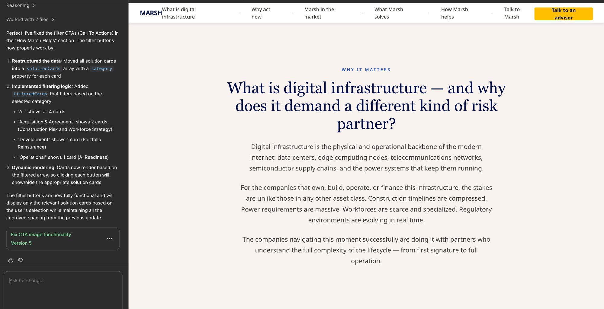
Figma Make output — context section. Sticky navigation bar with Gold 750 CTA, Neutral 250 off-white background, centered editorial layout. The section establishes stakes before any statistics appear.
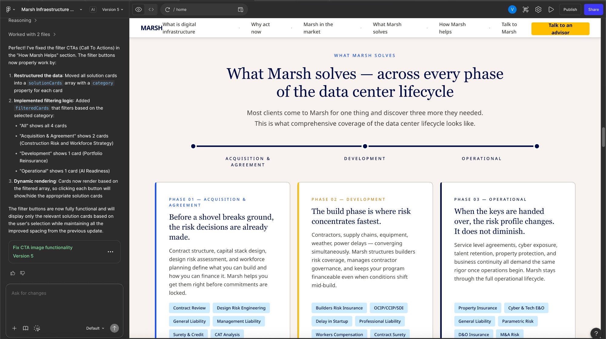
Figma Make output — lifecycle phase cards. Three-column layout with timeline graphic above, left-bordered cards per phase, and service chips at the bottom of each card. This replaced the long-scroll format and served as the key visual for management review.
lightbulbWhat Figma Make changed in the workflow
The Figma Make step compressed a day of static wireframing into two to three hours of iterative prompt refinement. More importantly, it produced a prototype that management could review in a browser — not a Figma file that required a design tool to open. The combination of Claude-generated content structure with Figma Make visual output meant every management review session was working from a near-final artefact, not an early-stage mockup.
Phase Layout: From Lifecycle Diagram to Foleon Cards
The original lifecycle diagram (used as source reference) contained all the right content — risk areas and key solutions per phase — but in a format designed for a slide presentation, not a web publication. The Figma Make prototype validated the three-column approach with management; the final step was translating it into Foleon-native components with no custom code.
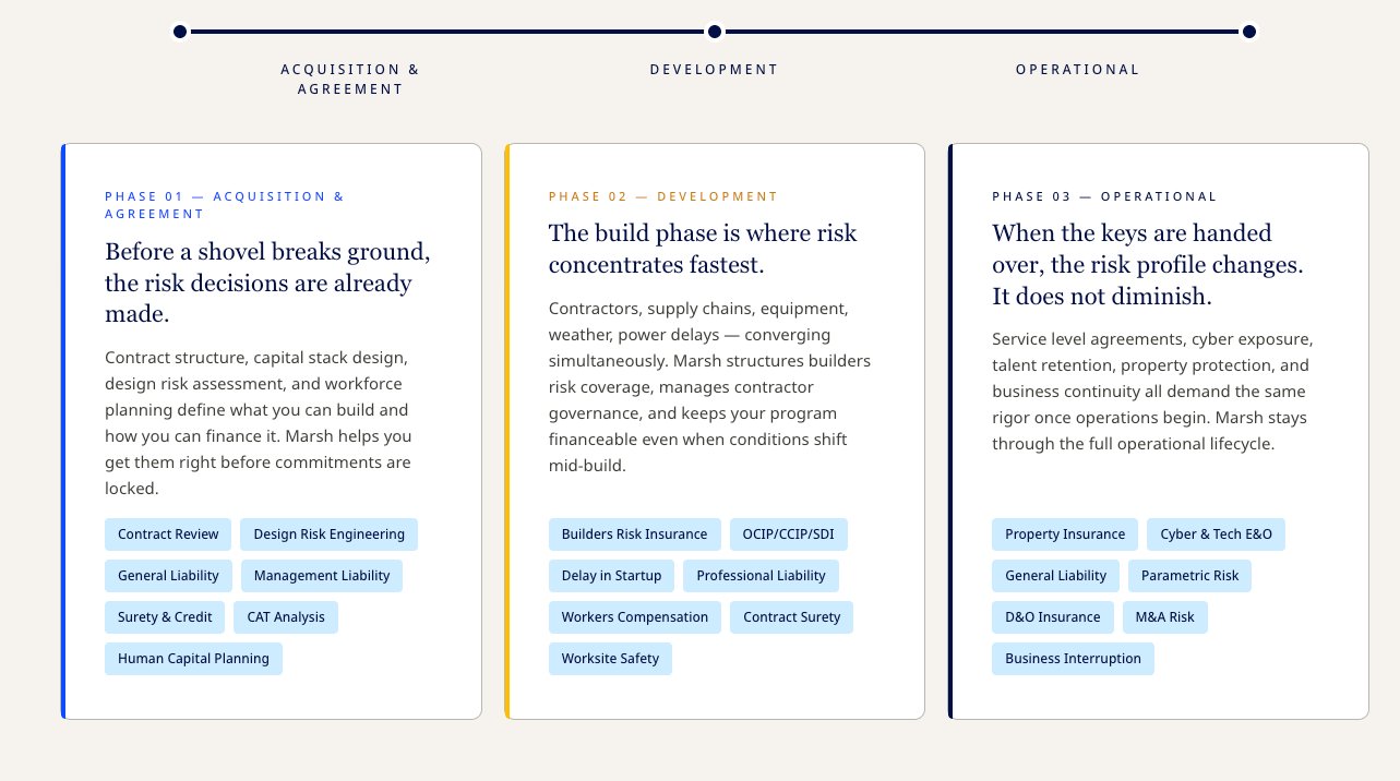
Design output — the three-column phase cards translated to Foleon. Each card: headline + body / key risk areas / service chip row. All Foleon-native. No tabs, no accordion, no custom interaction required.
Two Proposal Versions
Rather than a single proposal, the project produced two versions — each allowing specific decisions to be reviewed independently.
Version 01 — marsh_di_proposal.html
All Feedback AppliedComplete page design: all six sections with Claude-generated copy, three-column phase cards, four solution blocks, authority stat section, company capability banner, Marsh brand tokens applied throughout. The full proposed end state.
Version 02 — marsh_di_narrative_v2.html
Narrative-First RebuildA full rebuild focused exclusively on storytelling arc and rhythm. Eight-beat page journey restructured from first principles. Stats always follow context, never open. Each section ends with a forward pull sentence. Outcomes land last, as earned conclusions. Isolated the narrative question from the visual one.
descriptionClaude — Content Strategy
- BAU flow → 6-section page arc
- Brand token extraction
- Copy audit and rewrites
- Foleon constraint mapping
- Figma Make prompt generation
auto_awesomeFigma Make — Prototype
- Hero, context, phase sections
- Marsh brand token application
- Management review artefact
- Prompt iteration in real-time
- Browser-ready output
webFoleon — Translation
- 3-column block rows for phases
- Tag elements for service chips
- Two-column solution layouts
- MPower form integration
- Full-fidelity HTML proposals
Foleon Production Build
From Approved Proposal to Live Foleon Page
With the v1 proposal approved by management, the design moved into Foleon's production environment. Every layout decision made in Claude and validated in Figma Make was now translated component by component into Foleon's native block system — using only what the platform provides, and no custom code.
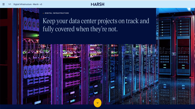
Foleon production page — full scroll walkthrough showing parallax hero, sticky navigation, all sections, and the final phase card layout in the live environment.
Component Translation
Every section of the approved design mapped to a specific Foleon block type. The constraint audit done at the start of the project meant there were no surprises during the build — each element already had a confirmed native equivalent.
| Section | Foleon Block / Component | Configuration |
|---|---|---|
| Hero | Full-bleed Image Block + Text Overlay | Midnight Blue background with data centre photography. Parallax scroll enabled on the image layer. Stat card as floating Text Block with Gold 750 border. |
| Sticky navigation | Foleon native Navigation Block | Marsh wordmark left, anchor links centre, Gold 750 CTA button right. Active state: Gold 750 underline per link on scroll position. |
| Context / What is DI | Single Column Text Block | Neutral 250 (#F7F3EE) background, centered editorial text. Noto Serif display heading, Noto Sans body. Max-width 800px via Foleon column width setting. |
| Three Forces (urgency) | 2-Column Block Row × 3 | Left: Text Block (narrative). Right: Text Block with background colour (stat card). Each row uses a different top-border colour: Blue, Gold, Navy. |
| Authority stats | 3-Column Block Row × 2 | Midnight Blue full-bleed section. Each stat: Text Block with Sky Blue background fill, top-border accent colour, stat number in Noto Serif 52px. |
| Lifecycle phases | 3-Column Block Row | Three stacked zones per card: Text (headline + body) / Text with Neutral 250 background (risk areas) / Tag Block row (service chips). Top border via column border setting. |
| Four capability pillars | 2-Column Block Row × 2 | Sky Blue (#CEECFF) section background. Each card: White fill, left border accent per capability, Text Block with company name footer. |
| How Marsh Helps (solutions) | Full-width Card Block × 4 | Each solution: header band (2-col Text), body grid (2-col Text), case study band (2-col Text with Gold 25 right column). Company badge as inline Text with border styling. |
| Lead generation | 2-Column Block + MPower Form Block | Left: trust signals as Text Block list. Right: MPower native form embed. Foleon form CRM connection configured separately by digital team. |
animationParallax — the one motion element Foleon supports natively
Foleon's platform doesn't support custom CSS animations or JavaScript interactions. But it does support parallax scroll on image blocks — and that single motion tool was used deliberately on the hero section to create depth between the data centre photography and the copy layer above it.
The parallax rate was set conservatively: the image moves at 0.3× the scroll speed, the copy layer at 1× (standard). This creates a subtle Z-axis separation that communicates scale without distracting from the headline. Every other motion in the page comes from Foleon's native entrance animations (fade-in on scroll) applied to the stat tiles and card rows — specified in the Figma Make handoff notes with timing values (600ms, ease-out) for the Foleon builder.
Motion & Interaction Specifications
Micro-interaction specifications were included in the Figma Make handoff to ensure the Foleon builder could configure each entrance animation consistently. Foleon supports scroll-triggered fades and delays — these were mapped to the visual weight of each component.
| Element | Foleon Animation | Duration | Delay / Notes |
|---|---|---|---|
| Hero image layer | Parallax scroll (0.3× rate) | Continuous | Creates depth between photo and headline copy. Only motion element above the fold. |
| Hero copy + CTAs | Fade in on page load | 600ms ease-out | Staggered: eyebrow 0ms, H1 100ms, subhead 200ms, CTAs 350ms. |
| Stat tiles (authority section) | Fade in on scroll entry | 500ms ease-out | Tiles animate in pairs (2 per trigger) across the 3-column grid. 80ms delay between columns. |
| Phase cards | Fade up on scroll entry | 600ms ease-out | All three cards trigger simultaneously. translateY(20px) → 0 on entry. |
| Solution blocks | Fade in on scroll entry | 500ms ease-out | Each block animates independently as it enters the viewport. No stagger — maintains reading flow. |
| Nav CTA (hover) | Background opacity transition | 150ms | Gold 750 → 85% opacity on hover. Native Foleon button hover state. |
| Anchor nav links (scroll) | Active underline state | Instant | Gold 750 2px underline tracks active section on scroll. Foleon native scroll-spy behaviour. |
Results & Impact
What the Full Pipeline Produced
Proposals Delivered
Full fidelity
HTML simulations
Copy Headlines Rewritten
6+
documented pairs
Phase Layout
Foleon-native
no custom code
Production Build
Parallax
+ motion specs
Deliverables
Reflections