MCM Design System
Foundation to Production
Building a complete design system from scratch for a fintech platform — from Figma tokens to production-ready React components using ShadCN/ui, Atomic Design methodology, and AI-powered documentation.
Context & Challenge
A Legacy System with No Design Foundation
The development team at MCM faced a critical challenge: they needed to rebuild a legacy fintech system from scratch, but the existing application had no design documentation, no component library, and no visual guidelines. Developers were working without a source of truth, leading to inconsistent UI implementations, duplicated effort, and constant back-and-forth with stakeholders about "how things should look."
The legacy system had accumulated years of ad-hoc design decisions — different button styles, inconsistent spacing, conflicting color usage, and no responsive strategy. Every new feature required reinventing UI patterns that should have been standardized long ago.
Colors, typography, and spacing were hardcoded throughout the codebase with no centralized token system — making brand updates nearly impossible.
Developers rebuilt similar UI patterns from scratch for each feature, creating inconsistencies and wasting engineering time.
Design decisions lived in people's heads — no written specifications, no usage guidelines, no accessibility requirements documented.
No shared language between design and development — Figma files didn't map to code, handoffs were manual and error-prone.
adjustMy Brief
Build a complete design system from the ground up — establish the foundation layer with design tokens, select and configure a component framework, create internal components for the application, design all interaction flows, and deliver comprehensive documentation that enables the frontend team to build consistently and independently.
Key Decisions
Strategic Choices That Shaped the System
Building a design system from scratch required deliberate choices at every layer — from the component framework to the documentation strategy. These decisions defined the approach.
| Decision | What I Chose | Why | Tradeoff |
|---|---|---|---|
| Component framework | ShadCN/ui with Radix UI primitives | Copy-paste ownership, full customization, built-in accessibility, TypeScript-first | Requires more initial setup than pre-packaged libraries |
| Styling approach | Tailwind CSS with CSS Variables theming | Aligns with Figma Local Variables export; enables token-based theming | Learning curve for teams unfamiliar with utility-first CSS |
| Token architecture | Two-layer system: Primitives → Semantic tokens | Separates brand values from usage context; enables theming without breaking references | More complex setup than flat token structure |
| Documentation method | AI-powered generation with Claude + Figma MCP | Enabled comprehensive documentation at scale — 40+ components fully specified | Required prompt engineering and manual QA passes |
| Design-to-code workflow | Figma Code Connect + VS Code integration | Live connection between design components and React code; eliminates manual translation | Requires maintaining connection mappings as components evolve |
Framework Selection
Why ShadCN/ui?
After evaluating multiple component frameworks, I selected ShadCN/ui for this project. Unlike traditional component libraries, ShadCN gives you full ownership of the code while providing production-ready, accessible components.
Full Ownership
Components are copied into your codebase — no external dependencies or breaking changes from package updates.
Built-in Accessibility
Radix UI primitives provide WCAG-compliant keyboard navigation, ARIA attributes, and focus management out of the box.
Highly Customizable
Easy to apply custom tokens (colors, typography, spacing) without fighting against pre-defined styles.
Figma-to-Code Alignment
Official Figma kit maps 1:1 with React components, reducing friction in design handoffs.
CSS Variables Theming
Theming system aligns perfectly with Figma Local Variables → JSON export workflow.
Lightweight
Only include the components you use — no bloat from unused code.
Foundation Layer
Building the Token Architecture
Using Atomic Design methodology, I established the Foundation layer with primitive tokens in Figma Local Variables — color scales, typography, and layout spacing. These tokens became the single source of truth for both design and development.
Primitives
- MCM Blue (50–900)
- MCM Green (50–900)
- Semantic colors (Red, Orange, Yellow)
- Base typography scale
Semantic Tokens
- Background, foreground
- Primary, secondary, accent
- Destructive, muted
- Border, ring, input
JSON Export
- camelCase naming
- Hex color format
- Tailwind config ready
- CSS variables mapping
Production
- Tailwind theme config
- CSS custom properties
- Component styling
- Dark mode support
Token Export Workflow
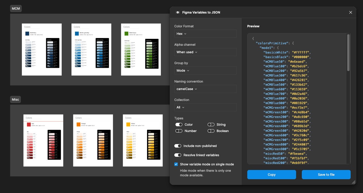
info Figma Local Variables exported to JSON from day one — enabling frontend developers to configure theming in parallel while design work continued.
Component System
ShadCN Configuration with MCM Theme
After purchasing the official ShadCN Figma template, I configured each component with tokens from the Foundation file — colors, typography, and layout (spacing, border radius, etc.).
To preserve the original template and enable easy updates, I created a separate "MCM" theme within Figma's Local Variables. This approach allowed switching between default ShadCN styling and the custom MCM brand without conflicts.
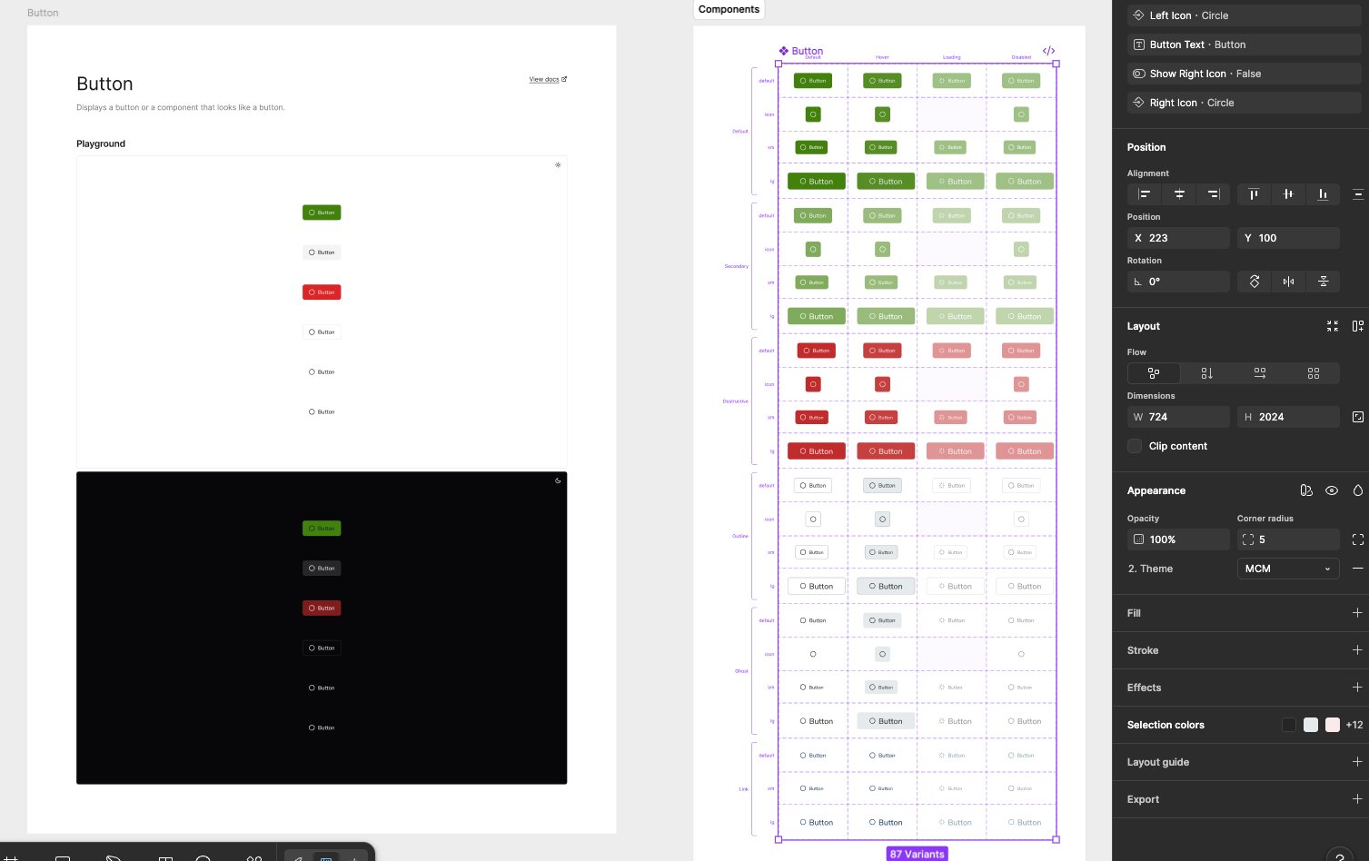
widgets87 Button Variants
The Button component alone includes 87 variants covering all states (default, hover, loading, disabled) across all style types (primary, secondary, destructive, outline, ghost, link) — ensuring complete coverage for the development team.
Internal Components
Mobile-First & Responsive
With the ShadCN template configured, I created the internal system components: Header (Login/Logout states), Footer, Login flows, Skeleton loaders, Error pages, and other core UI elements.
Header & Footer Components
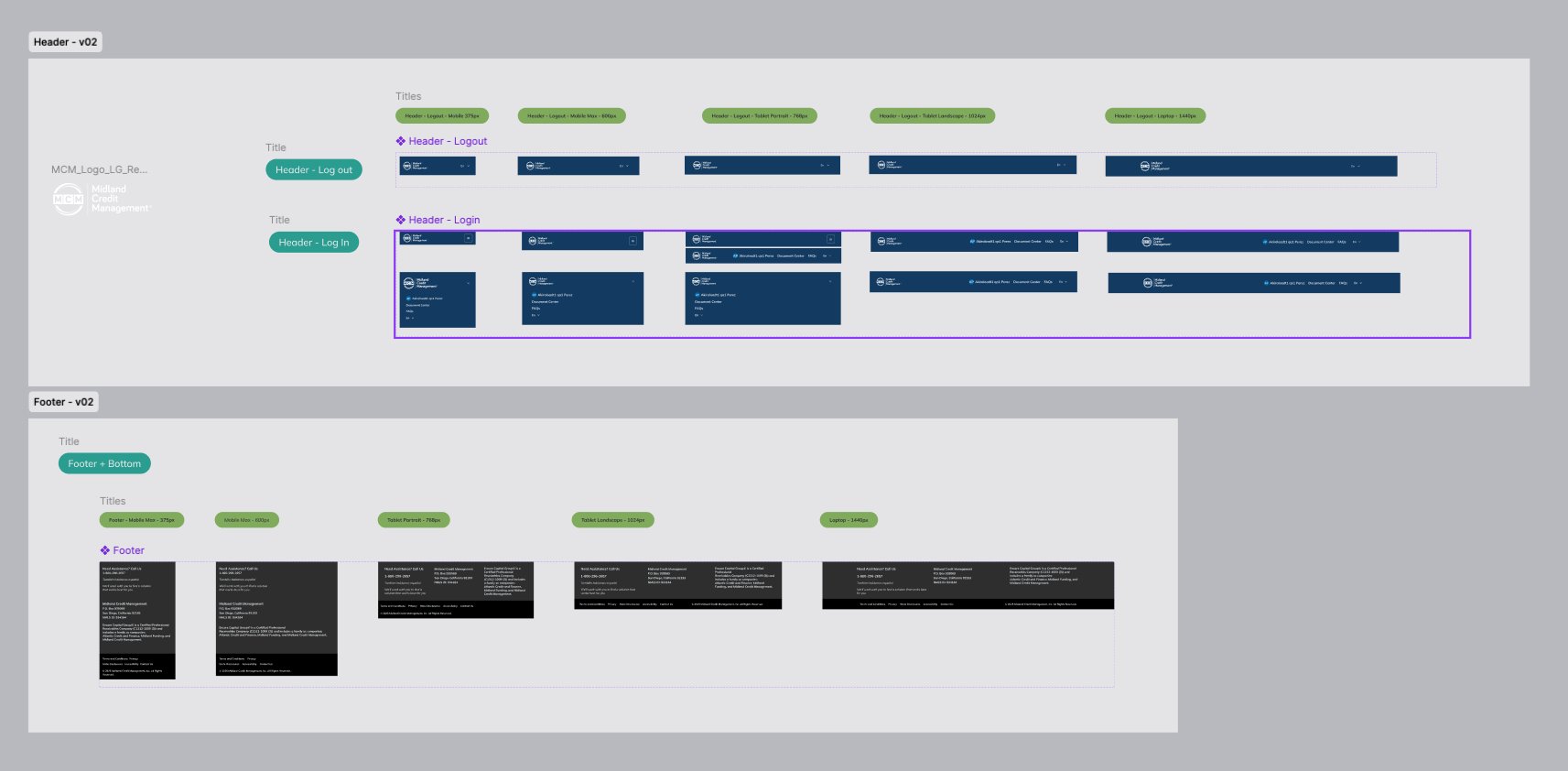
Mobile Min
Hamburger navigation, stacked footer sections, touch-optimized targets.
Mobile Max
Expanded footer layout, optimized form inputs.
Tablet Portrait
Two-column footer, condensed navigation visible.
Tablet Landscape
Full navigation visible, multi-column layouts.
Laptop
Maximum content width, full component display.
Interaction Flows
Agile Delivery by Sprint
Following Agile methodology, I developed complete interaction flows organized by sprints. Each flow was designed with full state coverage — including validation errors, empty fields, MFA verification, and success states.
Assets were delivered sprint-by-sprint, enabling parallel development while design continued on subsequent flows.
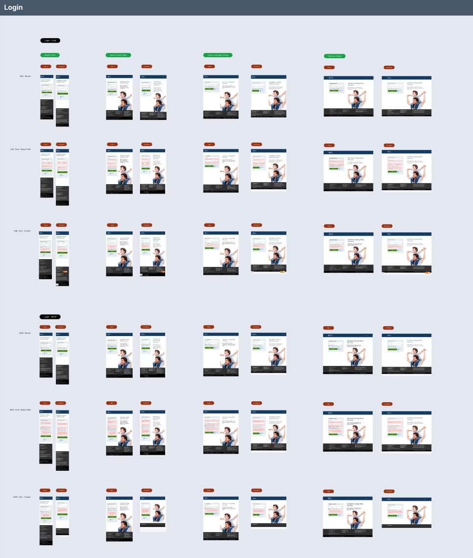
account_treeComplete State Coverage & Motion Specs
The Login flow alone includes 7 state variations (Draft Normal, Draft Empty Fields, Draft Error Account, Login MFA, MFA Error Empty Fields, MFA Error Account) across 4 breakpoints (375px, 768px, 1024px, 1440px). Each state was accompanied by micro-interaction specifications — transition timing, easing curves, and feedback animations — ensuring the frontend team had complete visual and motion specifications for every edge case.
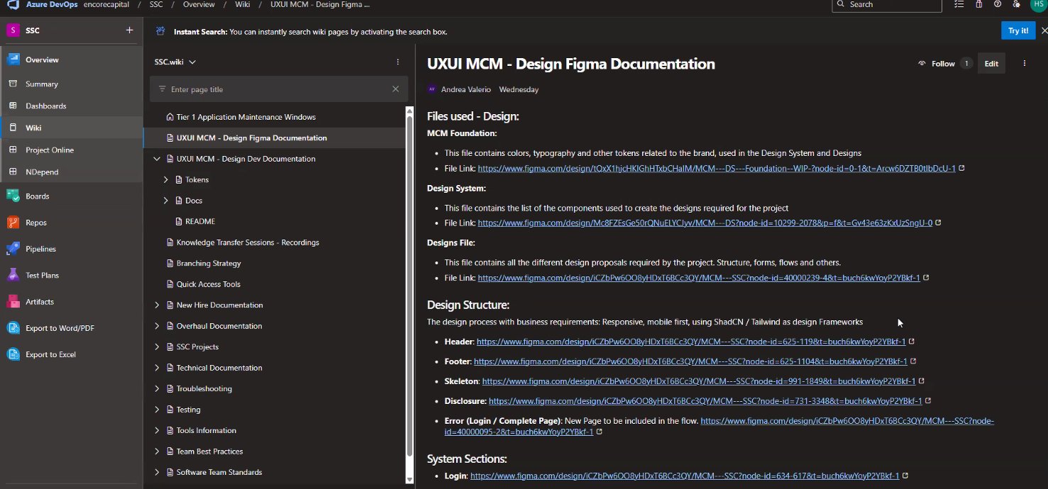
AI-Powered Handoff
Documentation at Scale with Claude + Figma MCP
When prototyping was complete, I began the handoff phase using Claude and Claude Console connected to Figma MCP. This AI-assisted workflow enabled comprehensive documentation at scale — generating CSS files, JS configurations, token documentation, and per-component specifications.
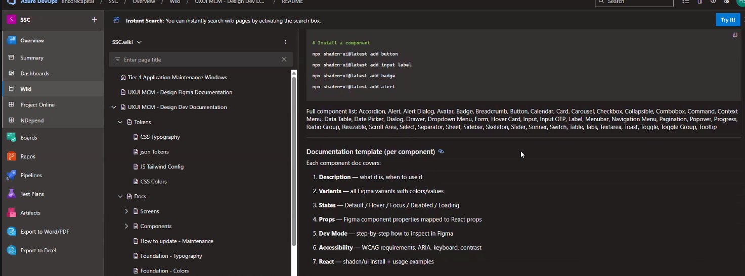
Documentation Template (Per Component)
descriptionDescription
- What it is
- When to use
- Component purpose
paletteVariants
- All Figma variants
- Color values
- Size options
touch_appStates
- Default / Hover
- Focus / Disabled
- Loading
data_objectProps
- Figma properties
- React props mapping
- TypeScript types
visibilityDev Mode
- Inspection steps
- Figma Dev Mode
- Export settings
accessibilityAccessibility
- WCAG requirements
- ARIA attributes
- Keyboard / Contrast
codeReact Code
- shadcn/ui install
- Usage examples
- Tailwind classes
Tailwind Token Mapping
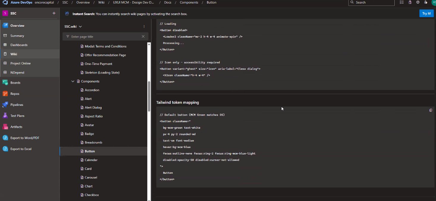
Design-to-Code
Figma Connect → VS Code → React
The final step bridged design directly to code. Using Figma Code Connect and the Figma VS Code plugin, I established live connections between design components and React code.
Each component shows a "Connected" status in Figma, with the corresponding React import and props automatically generated. The MCP Server integration enables the development team to pull design updates directly into their codebase.
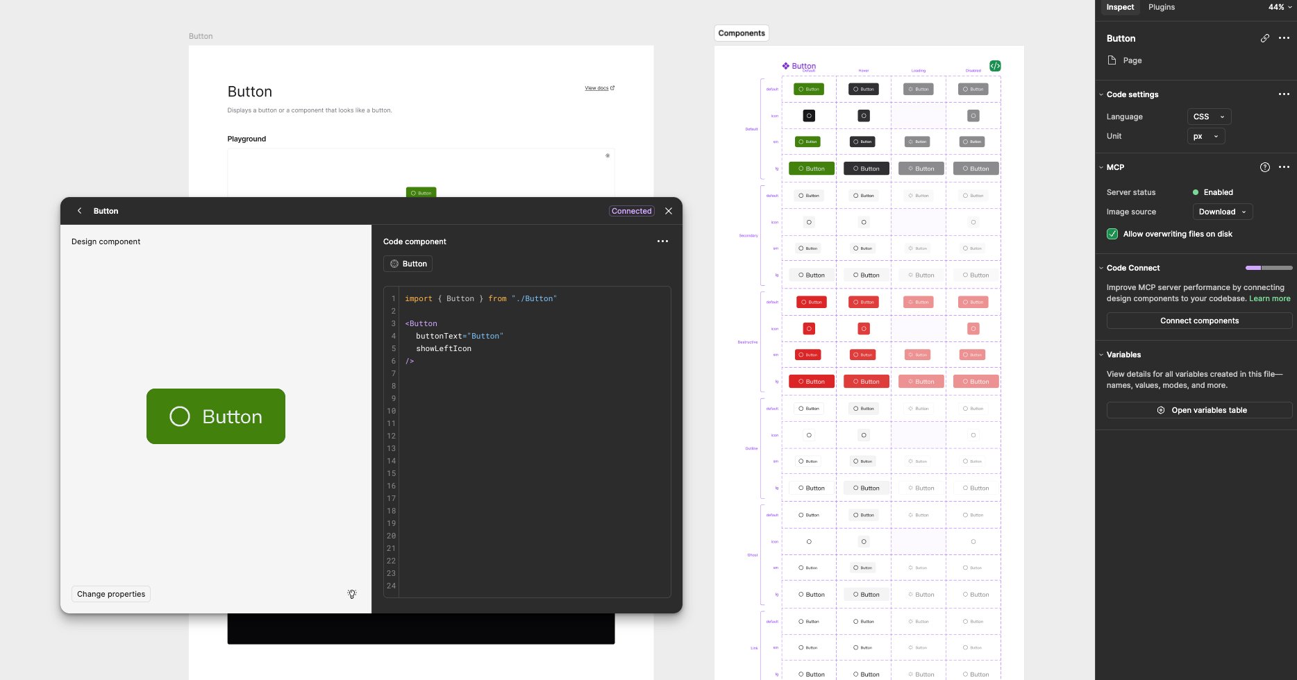
syncLive Design-Code Connection
This workflow eliminates manual translation between design and code — developers inspect a component in Figma and get production-ready React code with the exact props, variants, and token mappings defined in the design system.
Outcomes
Deliverables & Impact
Reflections