InfoAgro Platform Redesign
Enhancing the user experience of Costa Rica's agricultural information platform by improving navigation, optimizing for mobile, and modernizing the interface to better serve the farming community.
Context & Challenge
A Government Platform That Lost Its Users
The InfoAgro platform served farmers, agronomists, and agricultural experts across Costa Rica. But the original platform had complex navigation, poor mobile optimization, and an outdated design — leading to user frustration and reduced engagement.
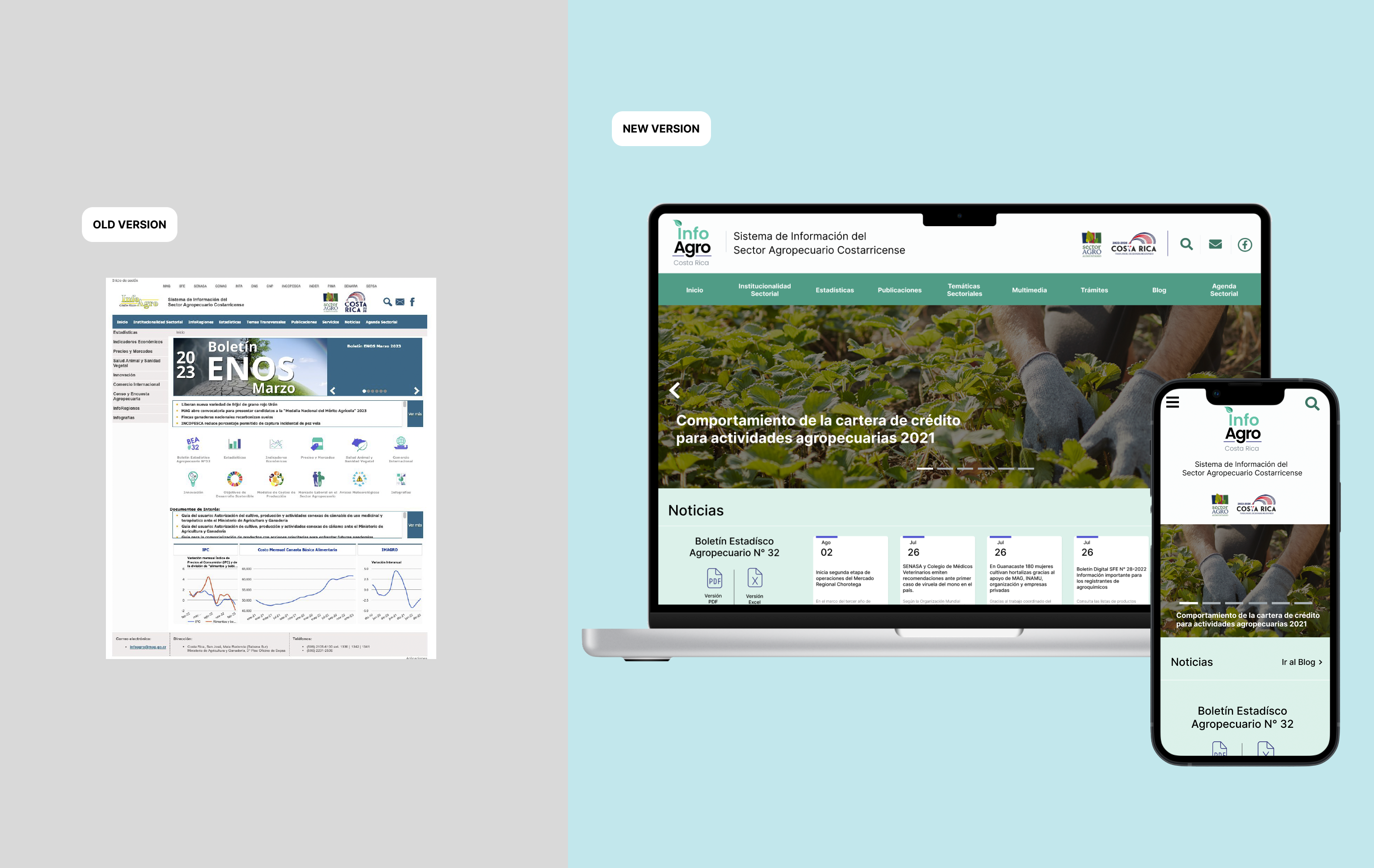
Before vs. After: The original platform vs. the redesigned interface
Users struggled to find relevant information due to a cluttered interface with no clear hierarchy or content organization.
The platform was not optimized for mobile, hindering accessibility for users in the field who needed information on the go.
The visual design did not align with modern expectations — poor use of space, no visual hierarchy, and an unintuitive layout.
Content lacked auditing — outdated and redundant information remained, making it harder to find timely, relevant data.
adjustMy Brief
Create a more user-friendly, modern, and mobile-optimized platform that simplifies navigation, enhances user engagement, and better meets the needs of InfoAgro's diverse user base — from farmers checking prices in the field to agronomists running reports at their desks.
Key Decisions
Strategic Choices That Shaped the Redesign
| Decision | What I Chose | Why | Tradeoff |
|---|---|---|---|
| Research approach | SWOT + empathy mapping + user interviews + surveys | Needed both qualitative depth and quantitative breadth to understand a diverse user base | More time-intensive research phase but stronger foundation for design decisions |
| Content strategy | Full content audit + card sorting + new sitemap | Navigation was the #1 pain point — couldn't redesign UI without fixing IA first | Required stakeholder alignment on content priorities before any visual work |
| Mobile strategy | Mobile-first responsive design | Many users are farmers accessing information in the field on mobile devices | More complex prototyping but addressed the core accessibility problem |
| Design system | Custom style guide with responsive component library | Government platform needed clear visual standards for long-term maintenance | Slower initial design but sustainable for the public institution |
Discovery & Research
Understanding Users in the Field
The discovery phase combined organizational analysis with direct user research — building a complete picture of how farmers, agronomists, and editors actually used the platform.
Research Snapshot
SWOT Analysis
Platform strengths, weaknesses, opportunities, threats
Identified that content quality was a strength but discoverability was the primary weakness — users couldn't find information they knew existed.
User Interviews & Surveys
End users across agricultural entities in Costa Rica
Confirmed three core problems: lack of content organization, poor information prioritization, and visual design issues reducing trust and engagement.
Empathy Mapping
Farmers, agronomists, system editors
Field users needed quick, mobile-friendly access to prices and weather. Office users needed reporting and content management tools.
Stakeholder Workshops
Government and agricultural organization teams
Mapped existing content workflows and identified that editors lacked tools for efficient content management, creating a maintenance bottleneck.
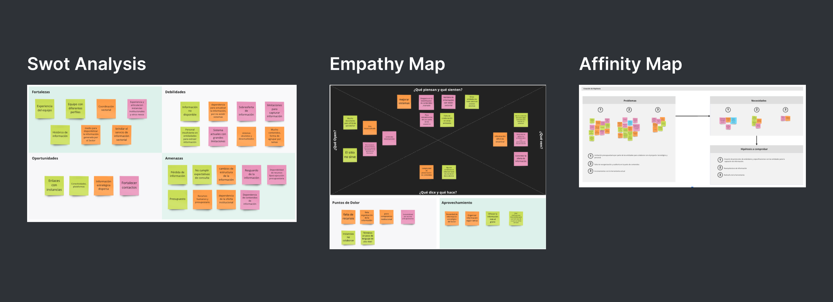
SWOT analysis, empathy mapping, and user research artifacts
Define & System Design
From Research to Architecture
Research findings were synthesized into personas, journey maps, and a prioritization matrix — then translated into a completely restructured information architecture.

Survey analysis — measuring end-user opinions across agricultural entities
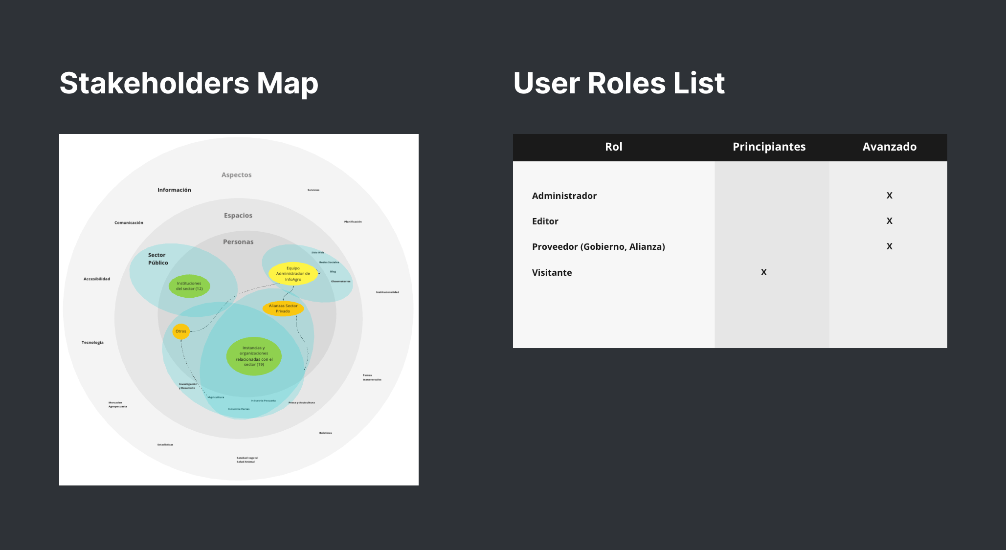
Stakeholder map — defining user roles and system functions
Four user personas representing different roles and needs
User journey maps for System Editor and Visitor scenarios
Prioritization matrix — evaluating solutions by impact and feasibility
Information Architecture
A complete content audit, card sorting exercise, and new sitemap restructured how information was organized and accessed across the platform.
Restructured sitemap — organizing content around user tasks rather than internal categories
Design Evolution
From Wireframes to Production
Custom Design System
Created a comprehensive style guide and design system tailored for the agricultural platform — ensuring visual consistency and long-term maintainability for the public institution.
Style guides — typography, colors, and spacing

Design system — reusable component library
Wireframes & Prototyping
Low-fidelity wireframes validated the new IA before moving to high-fidelity responsive prototypes across mobile and desktop.
Low-fidelity wireframes — validating IA and layout before visual design
High-Fidelity Prototypes
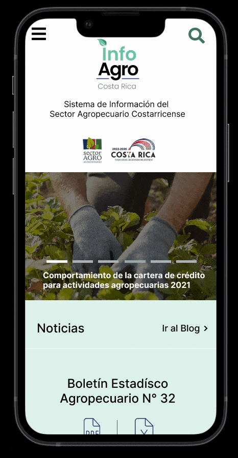
Mobile — responsive design for field access
Desktop — full-featured workspace for office users
Results & Impact
Measurable Outcomes
Navigation
Restructured
information architecture
Mobile
Responsive
field-ready access
User Satisfaction
Higher
engagement rates
Task Completion
Improved
completion rates
Deliverables
Reflections