Agents Management Platform
Redesigning a legacy internal operations platform used by customer support teams — restructuring information architecture, building a scalable component library, and delivering responsive prototypes across mobile, tablet, and desktop.
Context & Challenge
A Legacy Tool That Couldn't Keep Up
The Agents Platform was a critical internal tool used by customer support teams to manage cases, track workflows, and resolve issues. However, the legacy system had accumulated complexity over time — fragmented flows, no visual hierarchy, and inconsistent patterns created friction that impacted agent efficiency and accuracy.
The application was essentially a v1.0 with minimal UX consideration. Navigation was confusing with no clear menu structure, the visual design was outdated, and edge cases weren't handled gracefully.
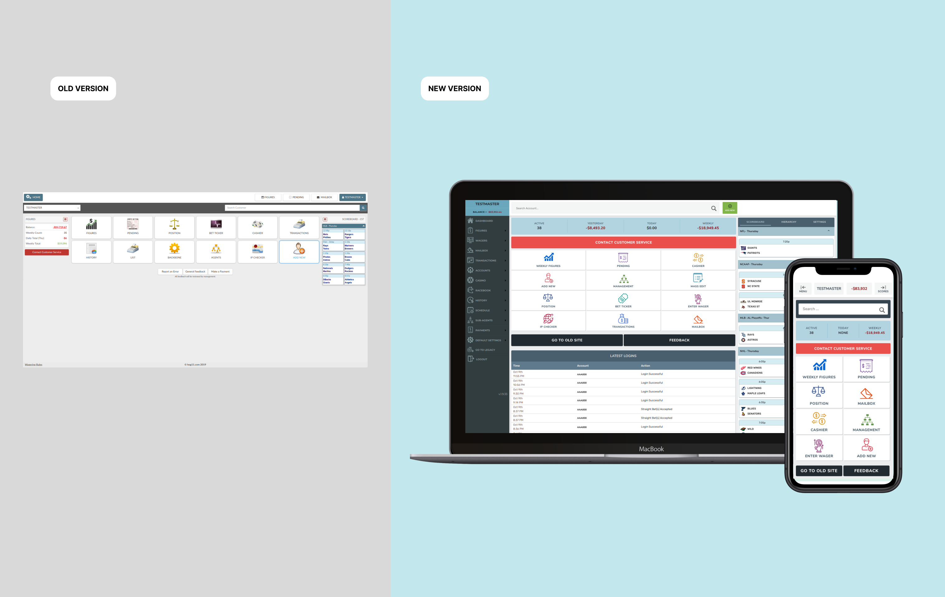
Before vs. After: Visual comparison of the platform redesign
Agents switched between multiple screens and tools to complete routine tasks, increasing cognitive load and delaying resolution.
Dense, flat layouts made it difficult to prioritize actions or find relevant data quickly.
The platform lacked modern UI conventions, reducing accessibility and creating a disjointed experience.
The UI didn't adapt well to complex or non-standard customer situations.
adjustMy Brief
Redesign the Agents Platform to simplify complex workflows, reduce cognitive load, and provide contextual guidance — so that agents can handle customer cases faster, with more confidence and fewer errors. Deliver a comprehensive design system, responsive prototypes, and Angular component support.
Key Decisions
Strategic Choices That Shaped the Redesign
| Decision | What I Chose | Why | Tradeoff |
|---|---|---|---|
| Research approach | Stakeholder interviews + proto-personas | No direct user access — stakeholders were the closest proxy for agent pain points | Less direct signal than user research; mitigated with benchmark analysis |
| Design system strategy | Comprehensive style guide + modular component library | Needed consistency across dozens of screens and fast handoff to Angular devs | Higher upfront investment before visible screen design |
| Responsive approach | Desktop-first with full tablet and mobile breakpoints | Primary use was desktop, but field agents needed mobile access | More design/dev effort than desktop-only |
| Implementation model | Designer-led Angular component development | Ensured pixel-perfect translation of design intent; reduced QA cycles | Required frontend skills beyond typical UX role |
Discovery & Research
Understanding the Problem
Without direct access to end users, I built understanding through benchmarks, stakeholder interviews, and a thorough content inventory of the existing application.
Research Snapshot
Benchmark Analysis
Industry standards for admin dashboards and internal tools
Identified modern patterns for data-dense interfaces — card layouts, contextual actions, collapsible panels — that the legacy tool was missing entirely.
Stakeholder Interviews
PM, engineering lead, and operations managers
Agents spent most time navigating rather than resolving — the #1 request was "fewer clicks to get to the right screen."
Content Inventory
Full audit of existing application screens and actions
The app was v1.0 with no clear menu hierarchy, confusing navigation, and inconsistent visual patterns across screens.
Proto-Persona Creation
Based on stakeholder knowledge of agent workflows
Defined two primary personas: senior agents handling complex cases and new agents needing guided workflows.
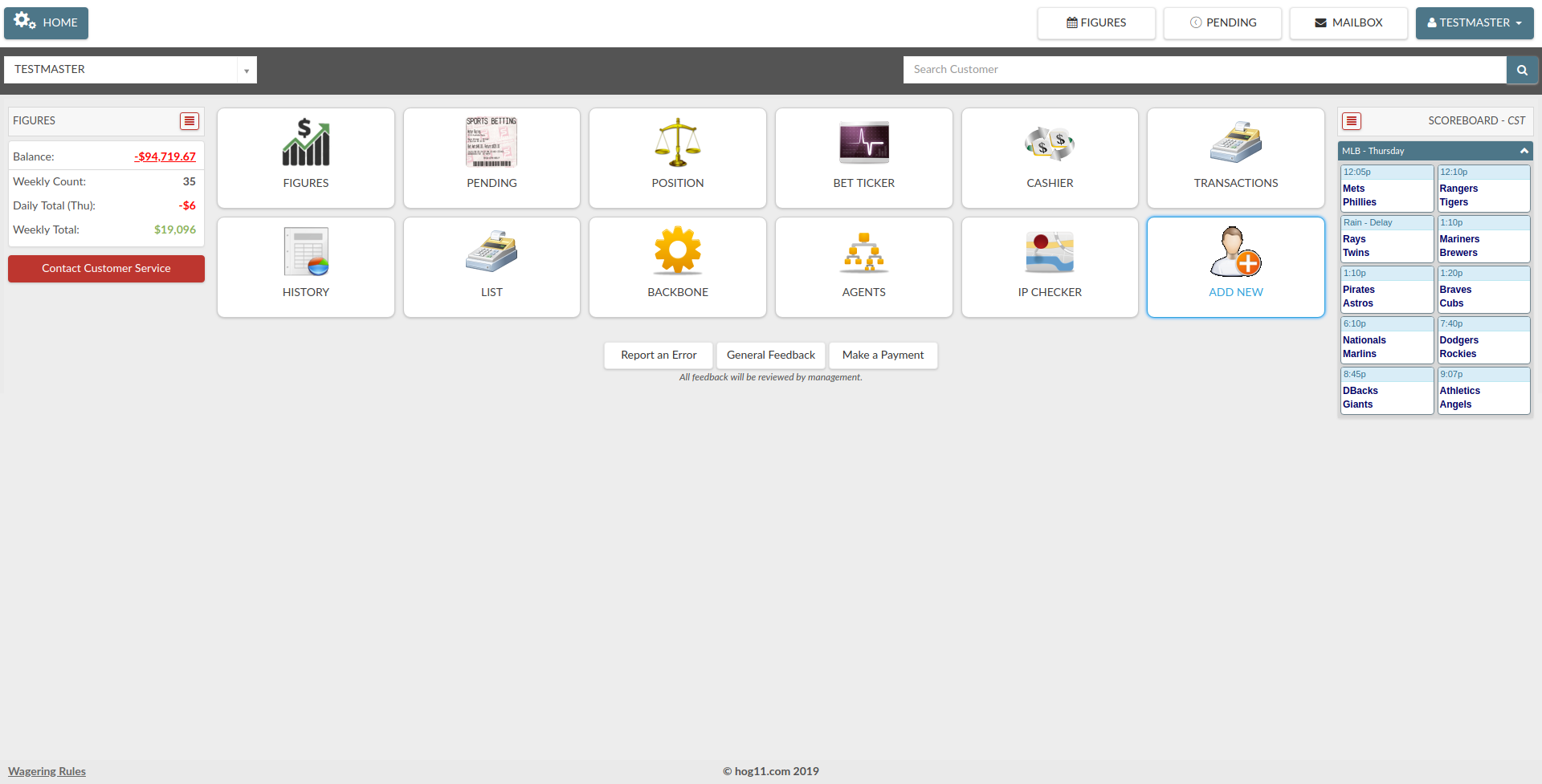
Analysis of the original interface — documenting structure, hierarchy, and pain points
System Design
From Legacy Interface to Modular Platform
The redesign wasn't just visual — it required restructuring the entire information architecture and building a design system that could scale across dozens of screens and three device breakpoints.
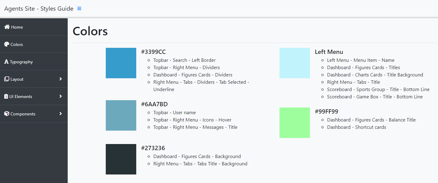
Style Guide & Foundations
Comprehensive documentation of colors, typography, spacing, and interaction patterns — the single source of truth for all design decisions.
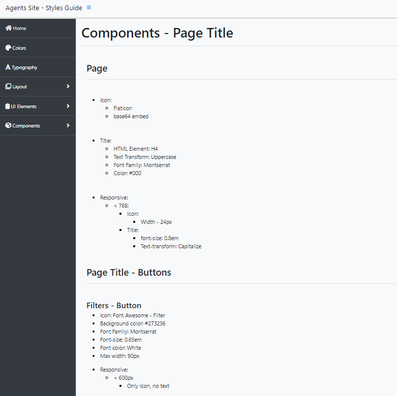
Component Library
Modular, reusable components with documented usage guidelines and code snippets for rapid prototyping and consistent implementation.
Dashboard Architecture
New information hierarchy prioritizing the most important data and actions, with contextual navigation replacing the flat legacy layout.
Responsive Framework
Full responsive design across mobile, tablet, and desktop — enabling field agents to access the platform on any device.
Style Guide — colors, typography, spacing, and interaction patterns
Component Library — modular components with usage guidelines and Angular code snippets
Design Evolution
Building the Solution
Design Progression
searchUnderstand
- Benchmark Analysis
- Stakeholder Interviews
- Content Inventory
- Information Architecture
drawDesign
- Low-Fi Wireframes
- Style Guide Creation
- Component Library
- Hi-Fi Prototypes
codeBuild
- Angular Implementation
- Component Documentation
- Frontend Support
- QA Collaboration
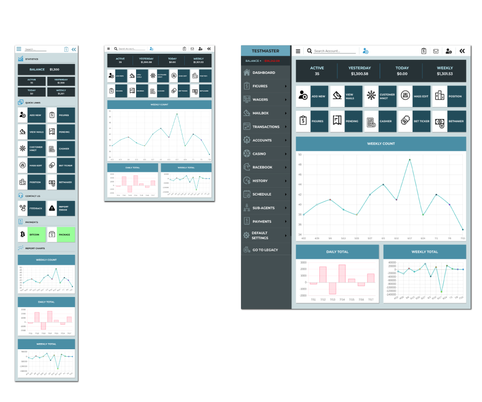
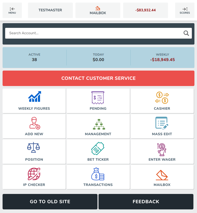
Dashboard Design
The new dashboard prioritizes the most important information and actions, with clear visual hierarchy and intuitive navigation. Contextual panels replace the flat, overwhelming layout of the legacy system.
Dashboard wireframe — card layout with contextual action panels and clear visual hierarchy
Dashboard views — case list, case detail, and performance screens
Solution
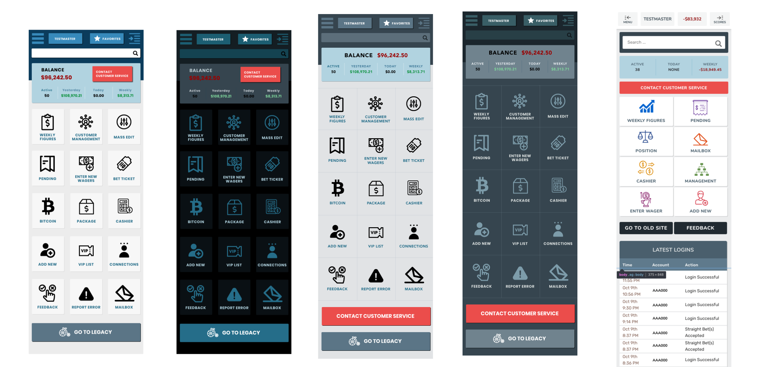
Final Product — Responsive Across Devices
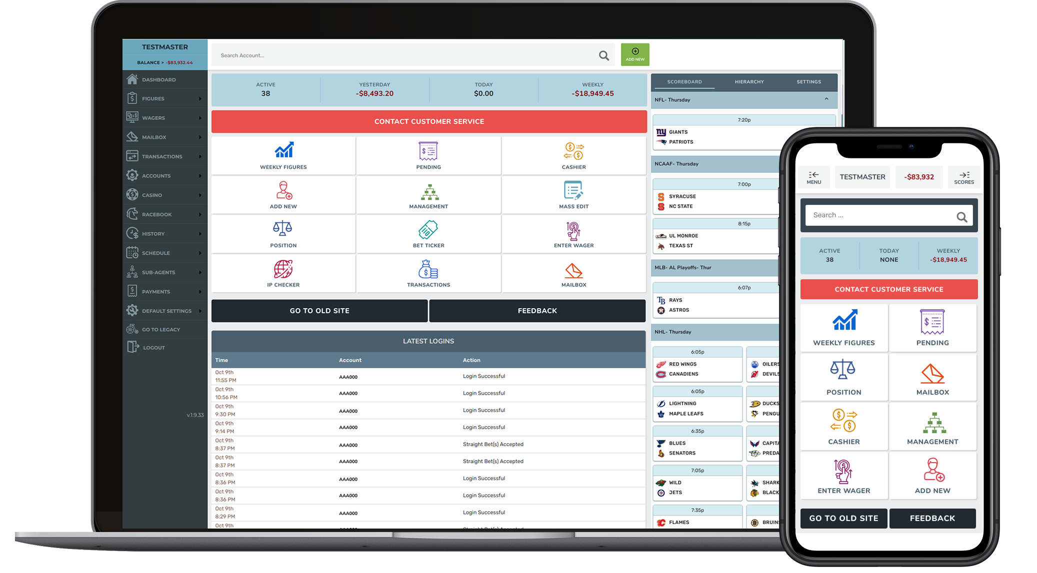
The redesigned platform introduced a modular interface, contextual workflows, and responsive design principles. Agents can now manage support cases more efficiently across mobile, tablet, and desktop.
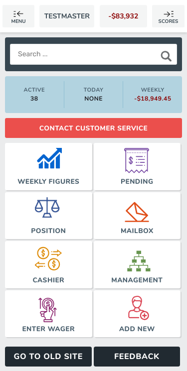
Mobile — responsive navigation and case summary
Tablet — two-column layout with sidebar navigation
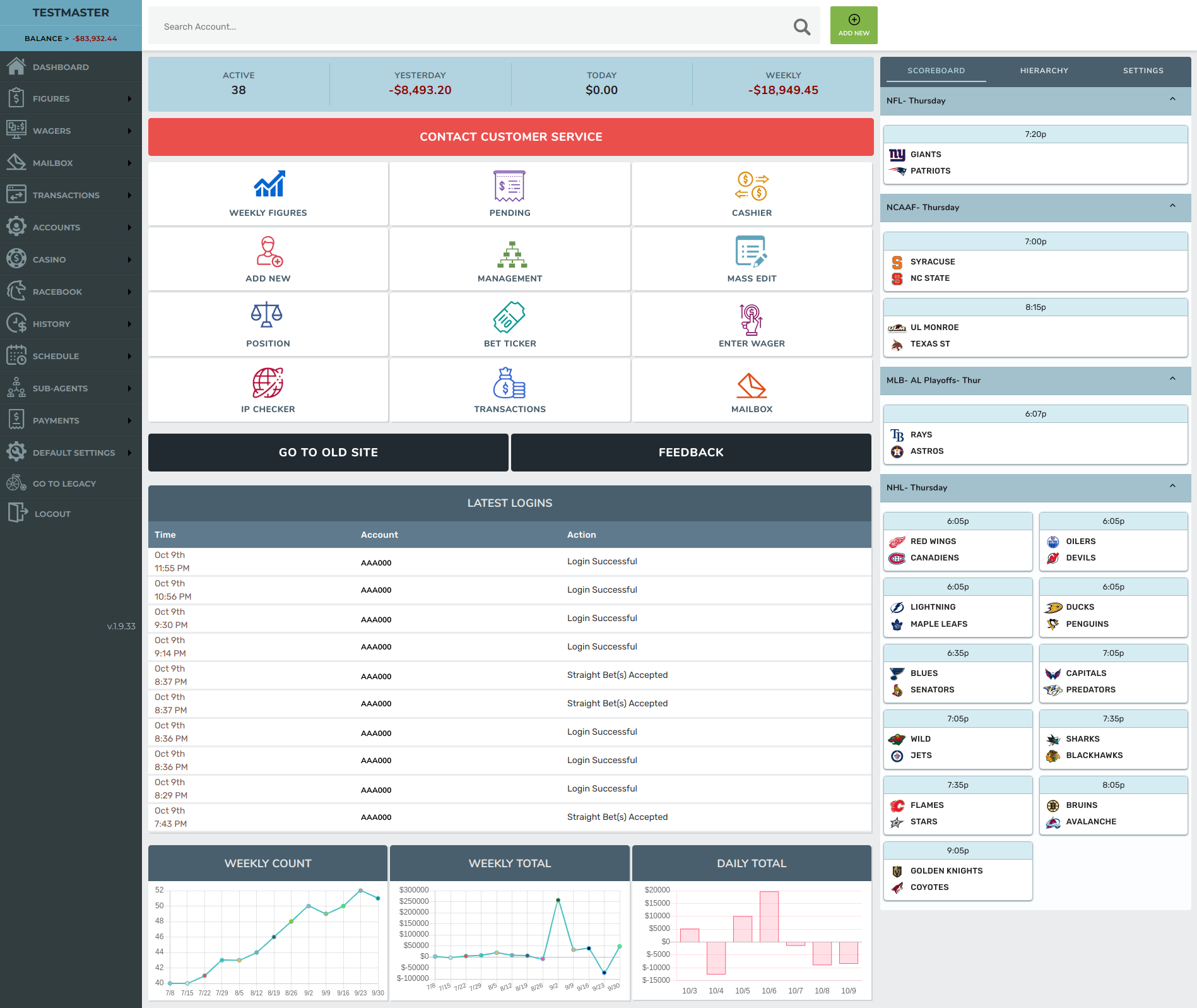
Desktop — full dashboard with data tables, contextual panels, and structured navigation
Results & Impact
Measurable Outcomes
Navigation
Restructured
information architecture
UI Consistency
100%
component coverage
Device Support
Responsive
mobile + tablet + desktop
Dev Handoff
Direct
designer-built code
Deliverables
Reflections