Personal Design System
Building a scalable, centralized design toolkit using atomic design principles and Figma Variables — enabling rapid prototyping, reusable components, and a strong visual identity across all consulting work.
Context & Challenge
The Problem with Starting from Scratch
After working across multiple industries — fintech, sustainability, and e-commerce — I noticed one recurring pattern: the constant need to recreate basic design elements for every new project. This wasn't only inefficient but also a barrier to consistency, scalability, and maintainability.
That's why I decided to create a personal design system — a flexible, centralized toolkit that would support rapid prototyping, reusable components, and a strong visual identity across all my freelance and consulting work.
Color palettes, type scales, spacing, and core components were rebuilt from scratch for each client — wasting hours on solved problems.
Without a shared system, each project had slightly different patterns — making portfolio work less cohesive and cross-project learnings harder to apply.
adjustMy Brief
Create a personal design system with Figma Variables, atomic design principles, and semantic token naming — flexible enough to adapt to any client brand while maintaining structural consistency across all consulting projects.
System Architecture
Four-Layer Design System
The system is built in four layers — each consuming tokens from the layer below, creating a single source of truth that can be themed and extended without breaking existing components.
Foundations
Color system with role-based palette (Primary, Secondary, Surface, Feedback), typography scale inspired by Material 3, 8pt spacing grid, and iconography guidelines.
Components
Deeply nested Figma components consuming variable tokens — buttons, inputs, cards, modals, headers, dropdowns — with variants for every state.
Variable Management
Figma Variables grouped by purpose: Color, Typography, Spacing, Border Radius. Semantic naming (e.g. --color-surface-background) enables real-time theming.
Project Application
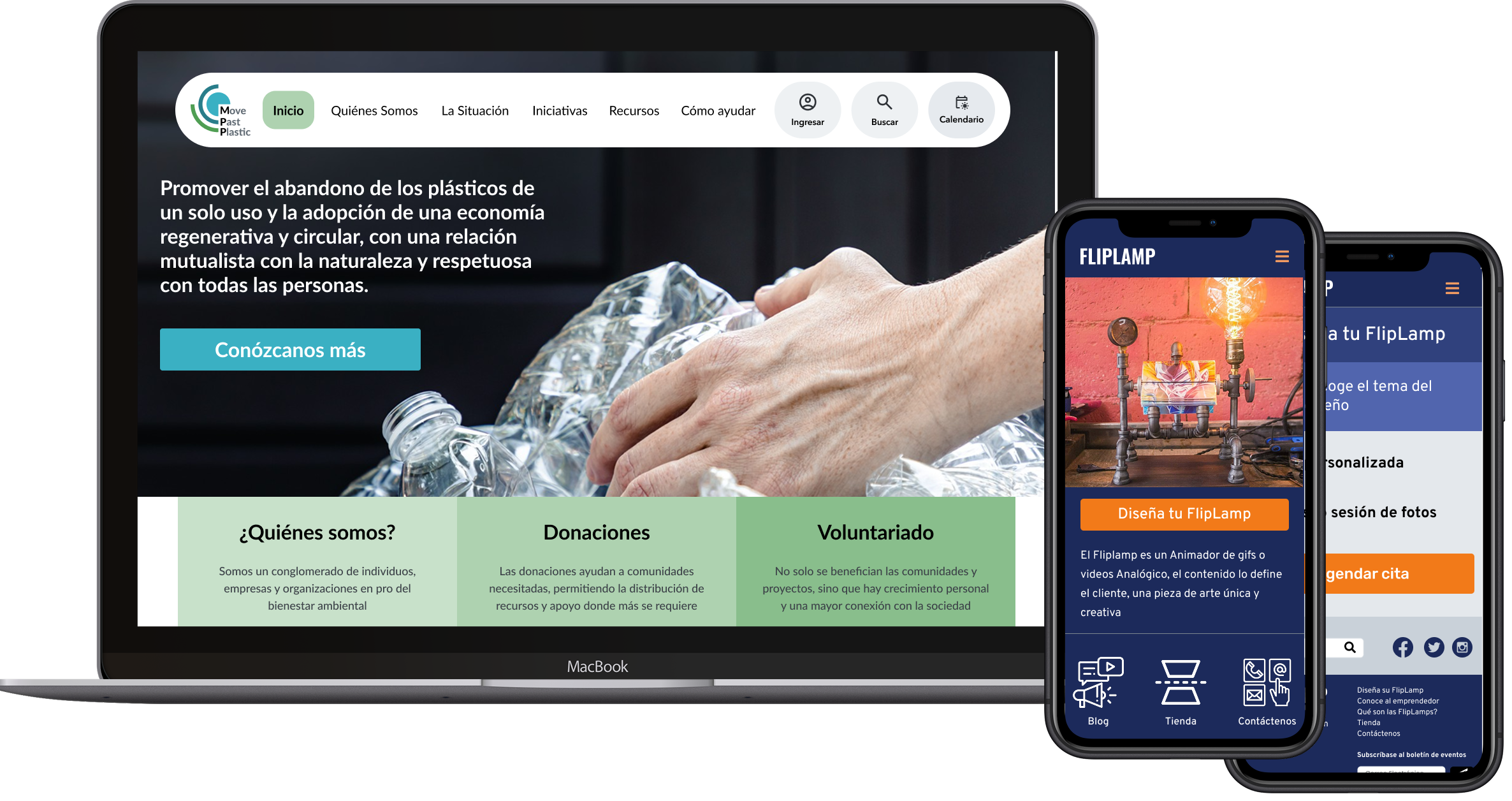
The system has been applied to BESS, MPP, and Energy Sector projects — each consuming the same structural foundation with client-specific brand tokens.
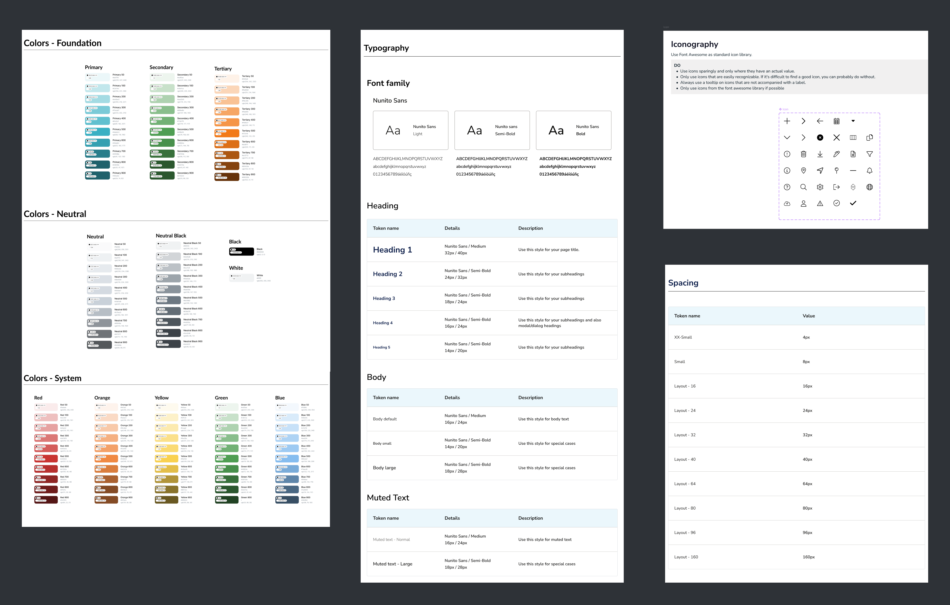
Foundations — color system, typography scale, spacing grid, and iconography
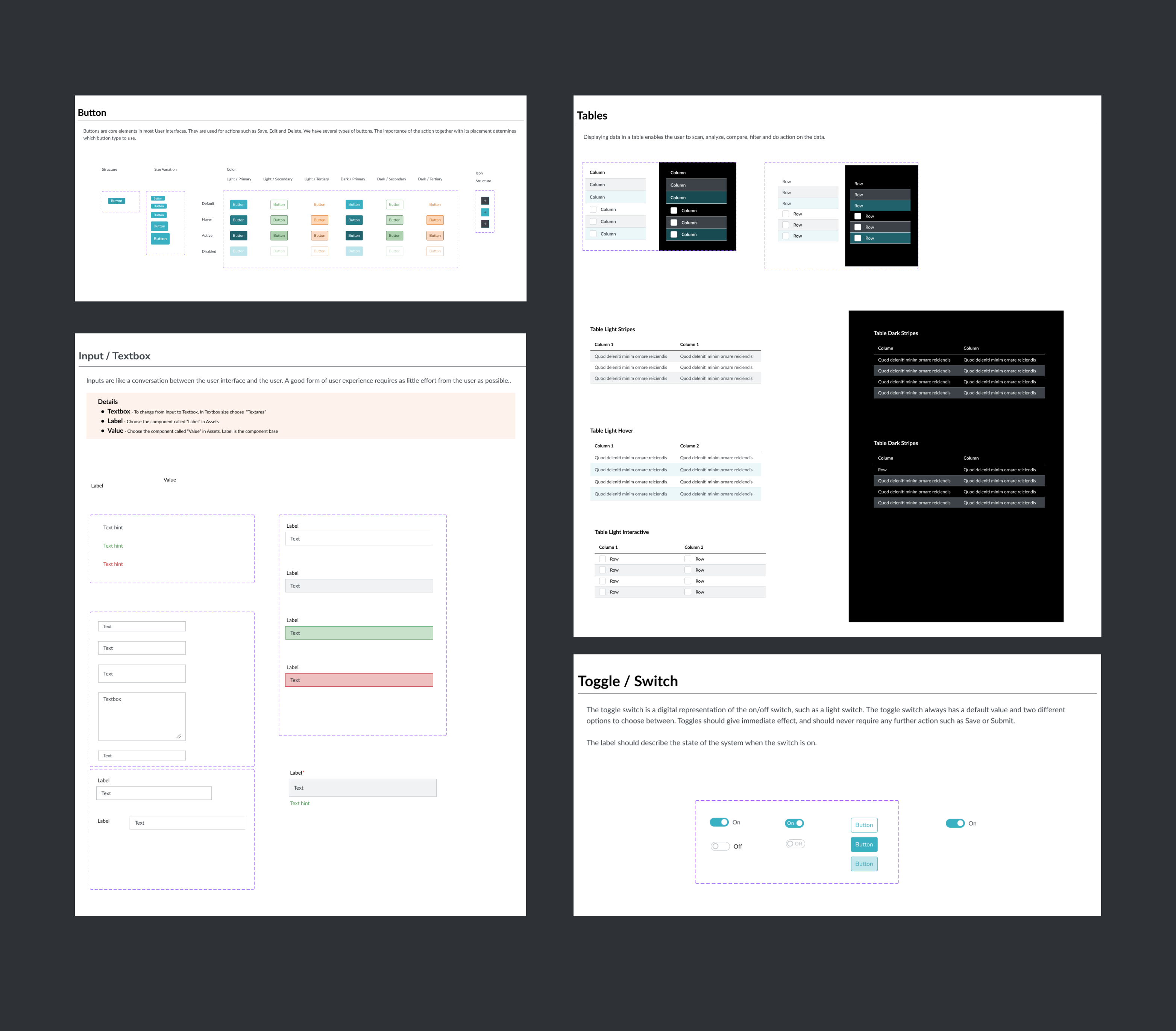
Components — nested Figma components with variants and properties
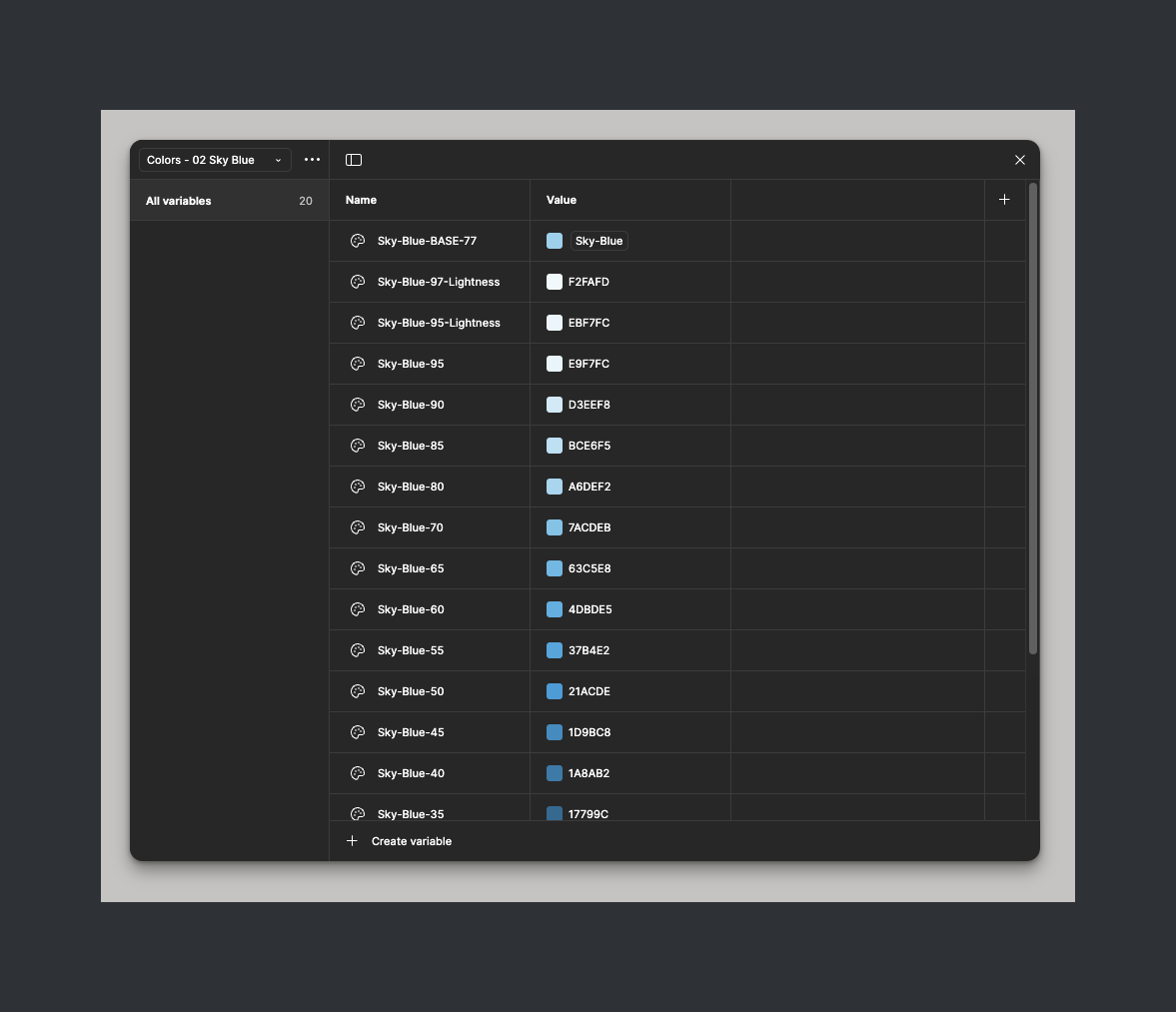
Variable management — semantic tokens mapped to design decisions
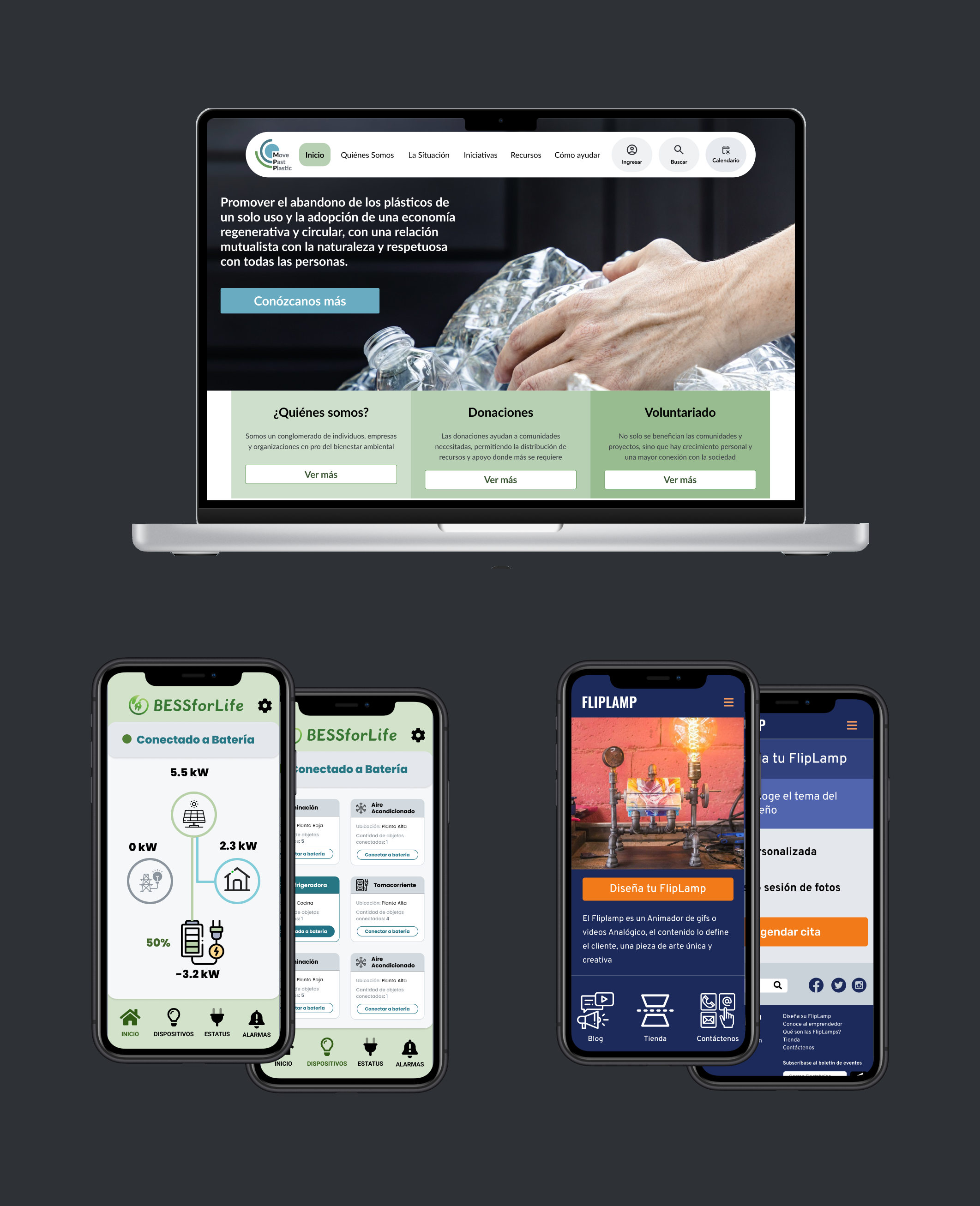
Applied to real projects — BESS, MPP, and consulting work
Results & Impact
Measurable Outcomes
Design Time
~30%
faster per feature
QA Issues
50%
fewer UI QA bugs
Adoption
100%
new projects use system
Theming
Minutes
to rebrand
Reflections