PPH Signup Redesign
Redesigning the RealBookies signup process with gamification elements, mobile optimization, and streamlined UX — increasing completion rates and reducing signup time through research-driven design and frontend implementation.
Context & Challenge
A Signup Process That Lost Users
The original signup process was complex and outdated — high abandonment rates, poor mobile experience, and no guidance through the multi-step flow. Users were frustrated by the length, lack of feedback, and complexity on mobile devices.
Many users did not complete signup due to its complexity and lack of step-by-step guidance.
The mobile experience was not optimized, directly affecting conversion rates on the dominant device.
The design did not meet modern user expectations in terms of aesthetics, accessibility, or usability.
The process lacked any motivational elements — users felt no progress or reward for continuing.
adjustMy Brief
Create a streamlined, mobile-friendly, and engaging signup process that reduces friction, increases completion rates, and reflects modern UX/UI best practices — incorporating gamification elements to keep users motivated throughout the flow.
Discovery & Research
Understanding Drop-Off Points
Research Snapshot
User Interviews
Current and churned users
Users were frustrated by the number of steps, lack of mobile optimization, and absence of guidance throughout the signup journey.
Competitive Analysis
Sports betting industry signup flows
Identified patterns and best practices — progressive disclosure, step indicators, and gamification were common in successful competitors.
Persona Development
Beginners vs. expert users
Created focused personas and customer journey maps showing where different user types abandoned the flow.
Prioritization Matrix
Feature impact vs. effort
Prioritized high-impact, low-effort features for MVP: step indicators, mobile-first layout, and progress gamification.
User research and competitive analysis
User personas — understanding beginner vs. expert users
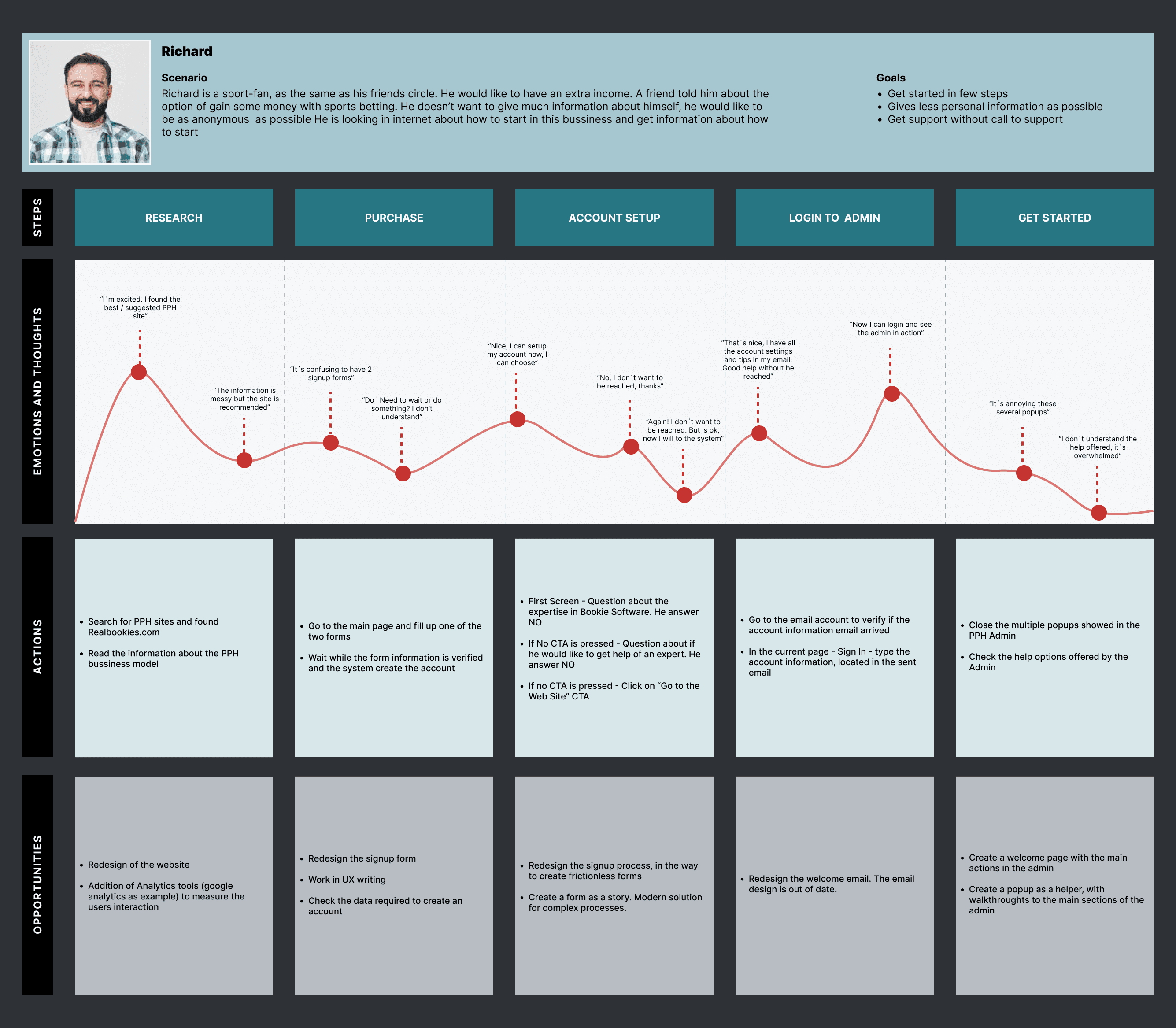
Customer journey map — tracking touchpoints, emotions, and drop-off points across the signup experience
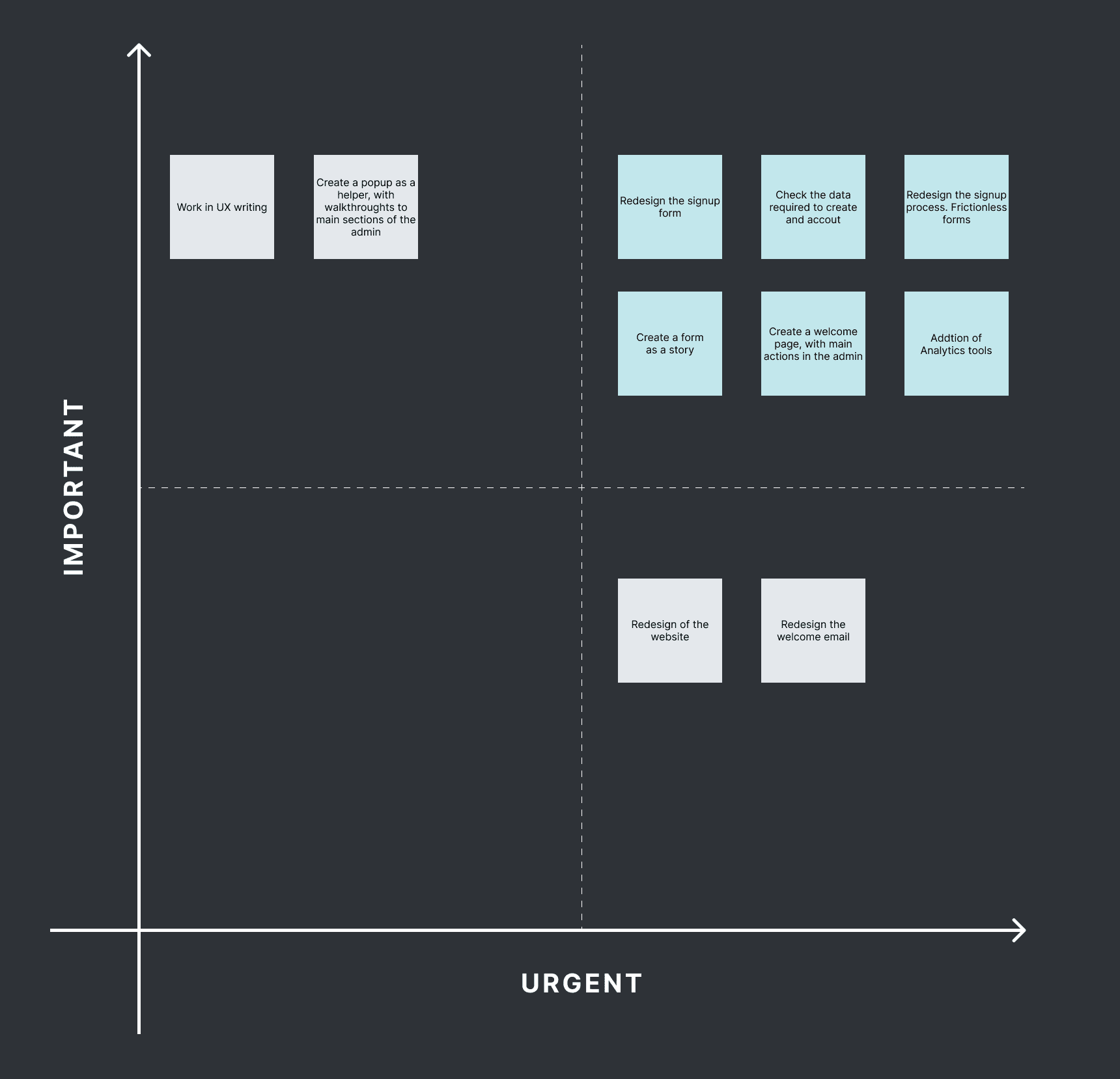
MVP prioritization matrix — IMPORTANT/URGENT framework for scoping highest-impact features first
Design Evolution
From Wireframes to Production
The design process followed a deliberate sequence — think before pixels, build the system before the screens, prototype before shipping.
Design Progression
route01 — Flow
- User flow mapping
- Manual sketching
- Step sequencing
- Error state planning
palette02 — Foundations
- Color token system
- Typography scale
- Spacing & elevation
- Semantic tokens
widgets03 — System
- Component library
- Form patterns
- Gamification elements
- Interaction states
devices04 — Prototype
- Mobile prototype
- Tablet prototype
- Desktop prototype
- A/B testing
code05 — Frontend
- HTML5 / CSS3
- Bootstrap grid
- Responsive layouts
- Microinteractions
Step 01
Flows & Manual Prototyping
Before committing to pixels, the signup journey was mapped as a detailed user flow — every decision point, branching condition, and error state documented. Alongside it, low-fidelity sketches were drawn by hand to explore step sequencing and form grouping without the overhead of a design tool. Paper-first let the team debate structure and discard bad ideas in minutes.
User Flow Mapping
End-to-end signup path with all decision branches, validation states, and recovery paths documented before any screen design began.
Hand-Drawn Sketches
Rapid paper prototypes exploring step grouping, field order, and gamification placement — iterated and discarded quickly before digital execution.
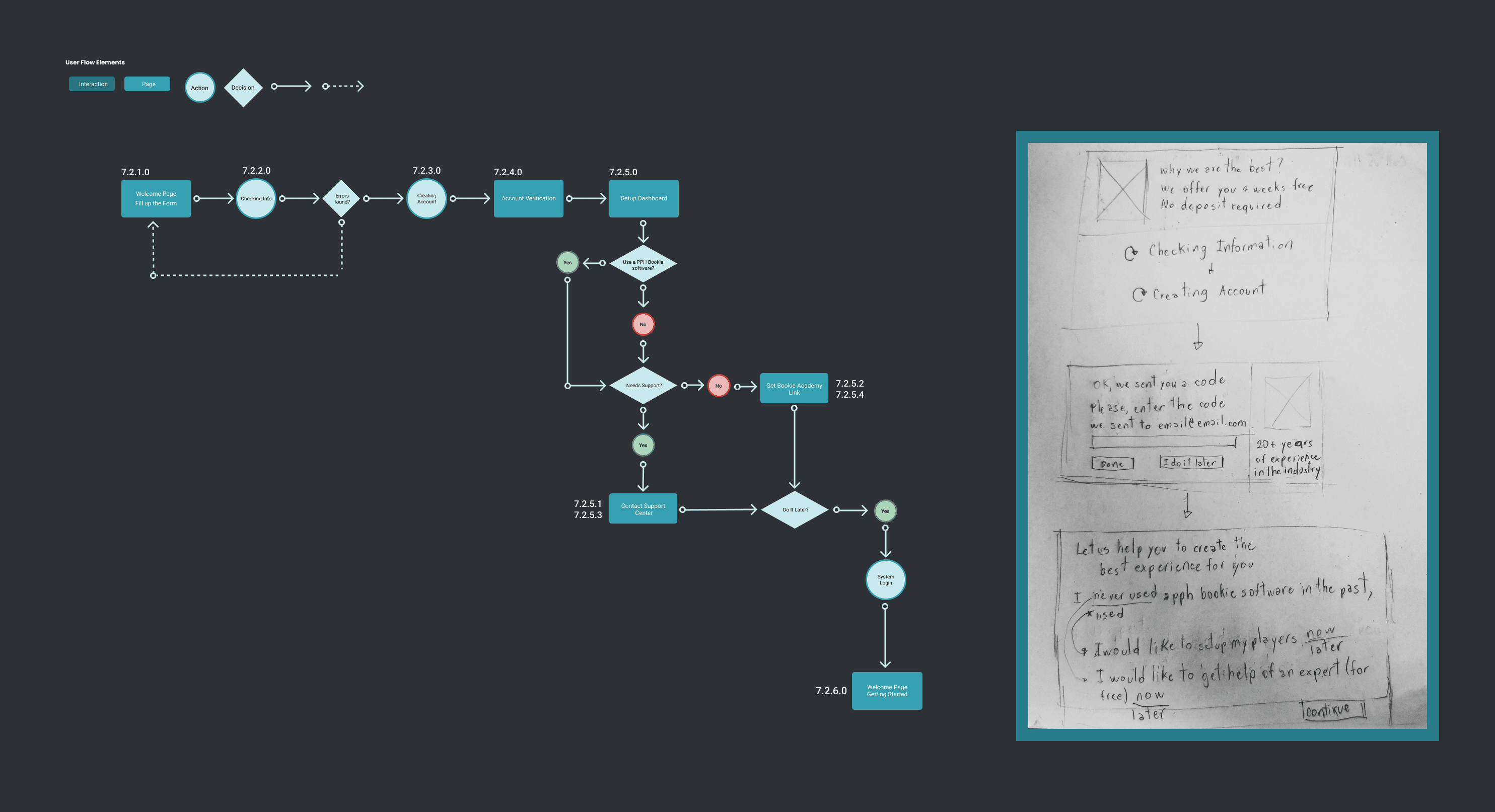
User flow diagram and manual prototyping sketches — structuring the signup journey before digital design
Step 02
Design Foundations & Tokens
With the flow agreed, a structured foundation layer was built before any component work. Color scales, semantic tokens, and a full typography system defined the visual language that would carry through every screen and breakpoint — making every subsequent design decision faster and more consistent.
Color Token System
Structured palette with primary, neutral, and status scales — semantic tokens mapped to component states for consistent application across breakpoints.
Typography Scale
Display, heading, and body levels defined with size, weight, and line-height — establishing visual hierarchy applied uniformly across all signup steps.
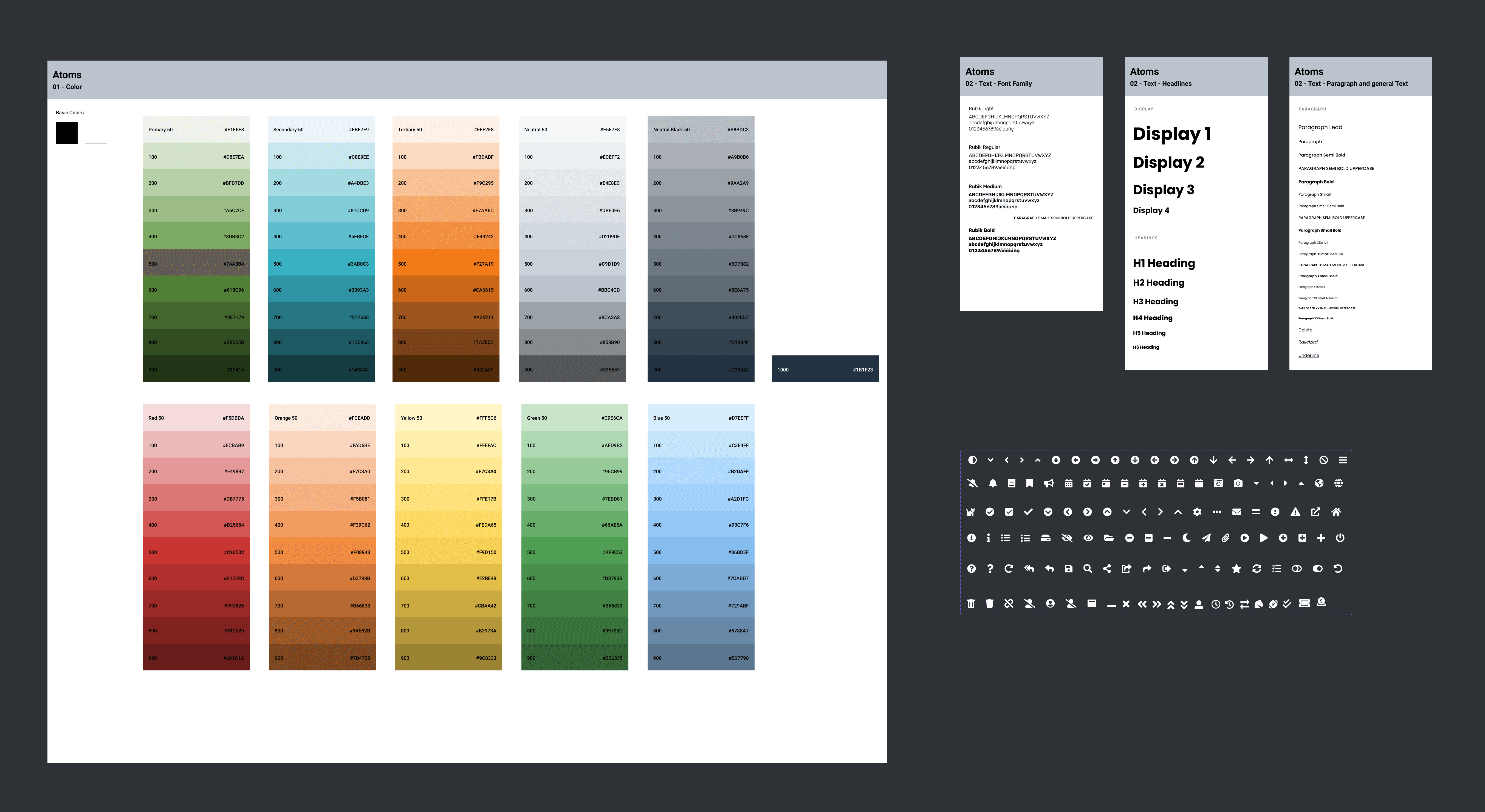
Color token system and typography scale — the foundation layer built before component design
Step 03
Component Library
With foundations locked, a full component library was assembled covering every UI pattern in the signup flow. Each component was documented with usage guidelines, interaction states, and responsive behavior — giving the team a single source of truth that eliminated inconsistency across the multi-step experience.
inputForm Patterns
- Text inputs & validation
- Dropdowns & selects
- Error & success states
- Field grouping logic
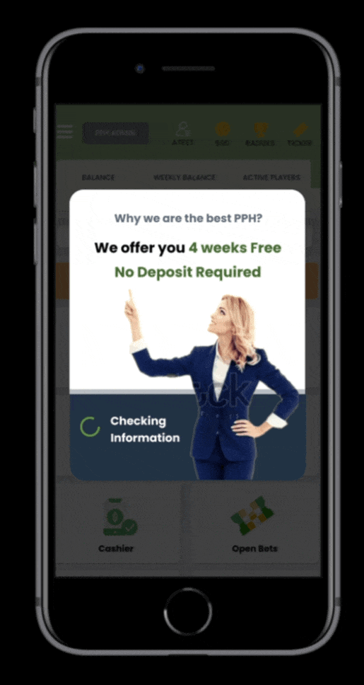
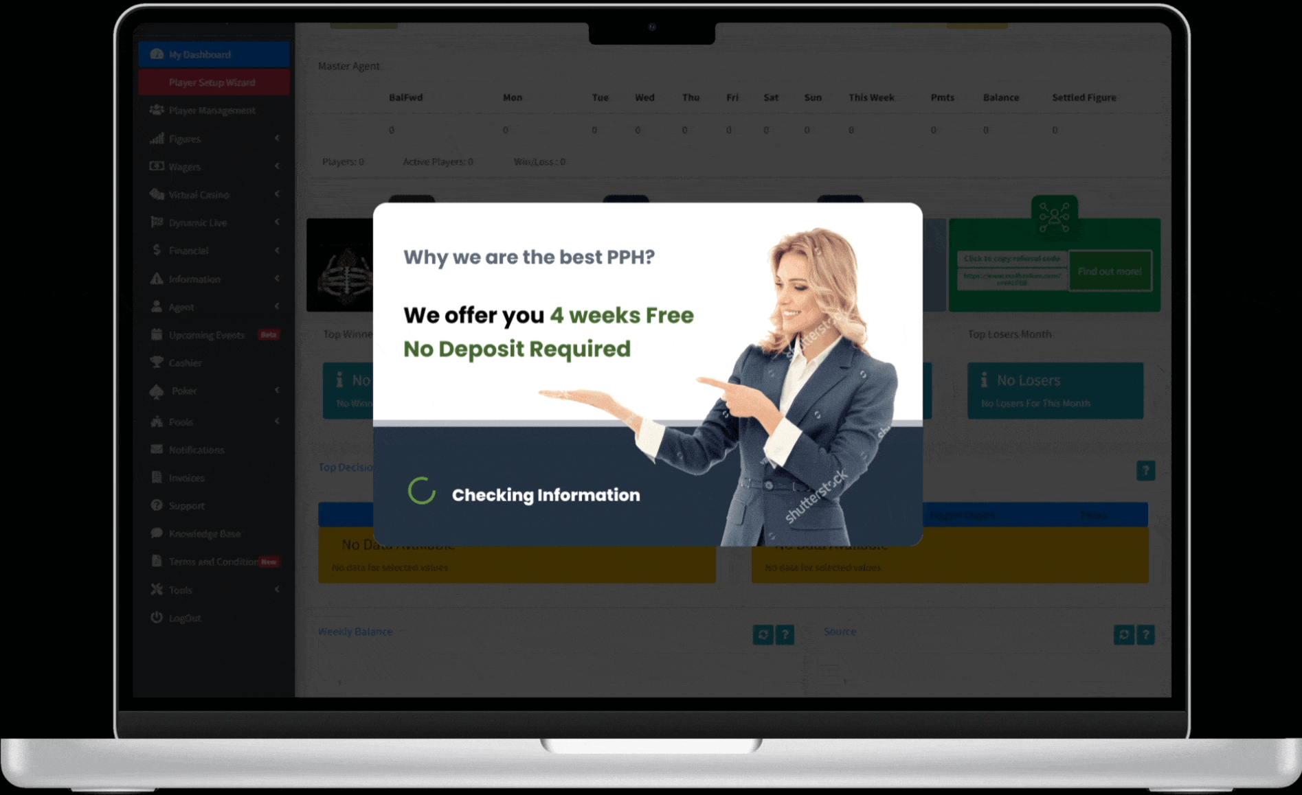
starsGamification
- Step progress indicator
- Achievement badges
- Completion feedback
- Motivational copy states
touch_appInteractions
- Hover & focus states
- Loading states
- Micro-animations
- Touch targets

Complete component library — all signup flow patterns, states, and responsive behaviors in one system
Step 04
Responsive Prototypes
With the component library complete, high-fidelity prototypes were built across all three breakpoints to validate the layout, flow transitions, and gamification elements before development. Mobile was the primary test surface — the dominant device for this audience. A/B testing confirmed the redesigned flow outperformed the original on completion rate and time-to-complete.
Mobile — primary conversion surface, optimized for touch

Tablet — two-column layout with expanded step context
Desktop — full experience with sidebar progress and gamification panel
Step 05
Frontend Implementation
Prototypes validated, the same designer built the product — implementing the full signup flow in HTML5, CSS3, and Bootstrap. CSS Grid and Flexbox handled the responsive layouts across breakpoints, while microinteractions provided instant visual feedback on every form interaction. Design-to-code handoff was zero-loss: the system built in Step 03 translated directly into production.

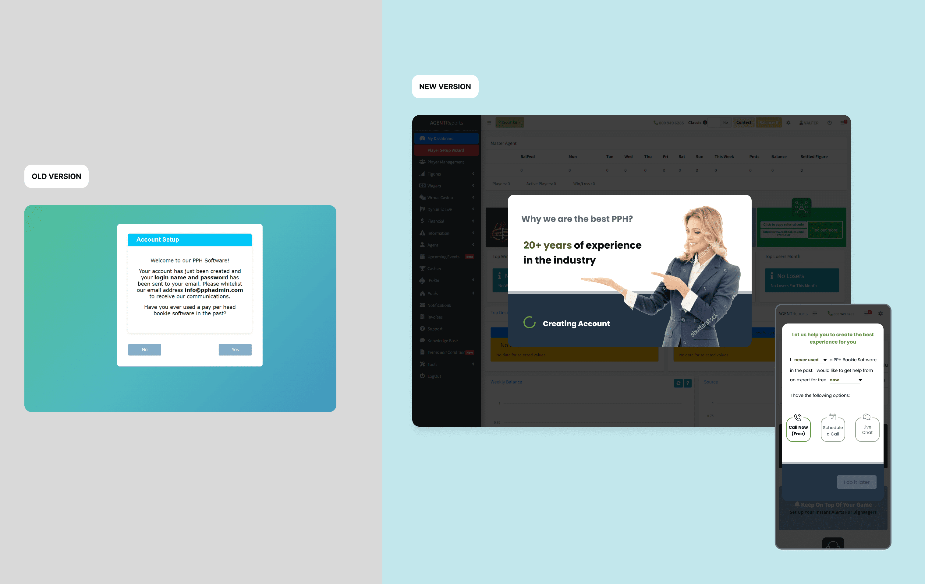
Live signup flow — HTML/CSS/Bootstrap implementation in production
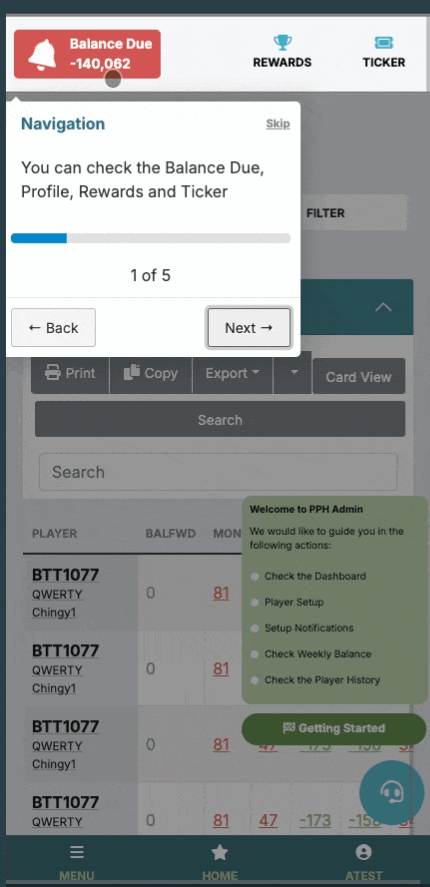
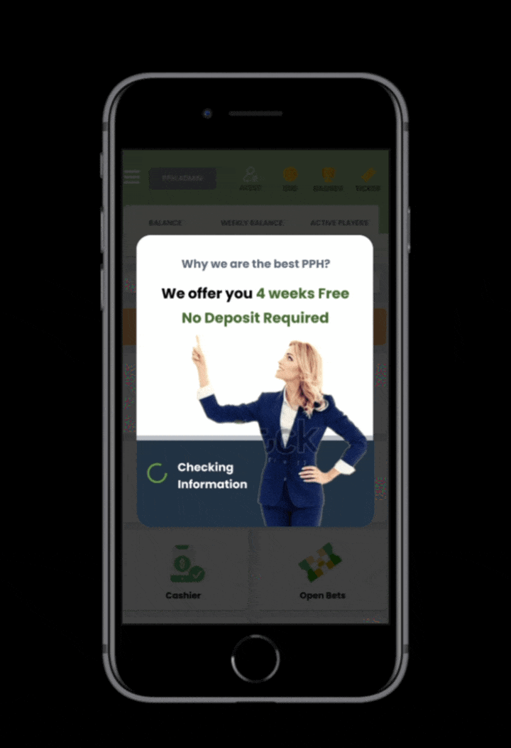
Post-signup experience — gamification and feature tour in production
Results & Impact
Measurable Outcomes
Completion Rate
30%
more signups completed
Time to Complete
50%
reduction in time
Mobile Experience
Mobile-first
responsive design
User Satisfaction
A/B Tested
validated improvement
Reflections